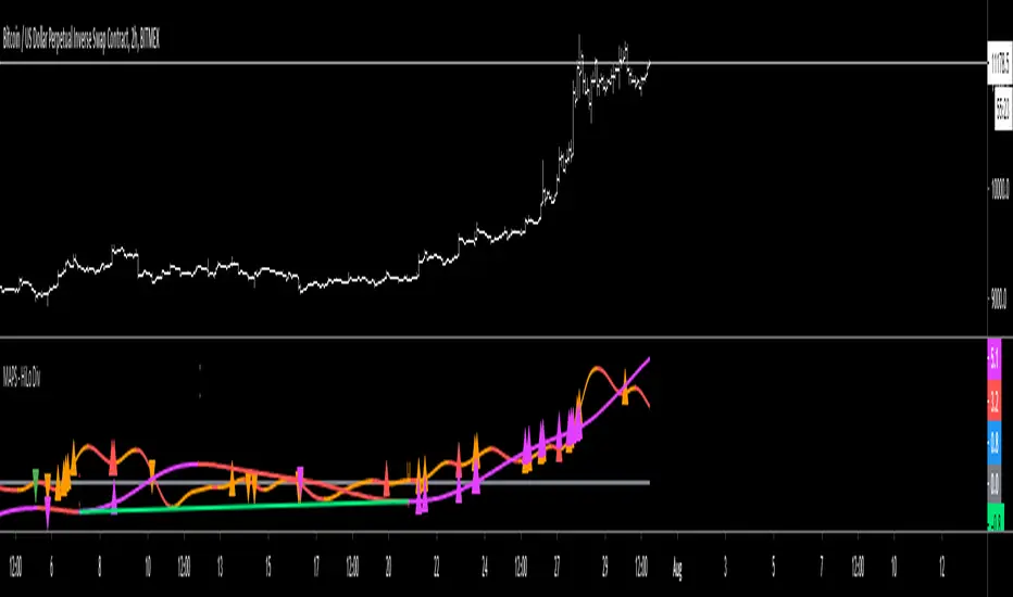
MAPS - HiLo DivergenceThe High/Low indicator utilizes the measuring of local highs and lows as well as local peaks and troughs to identify possible divergence in the price action.
Purple oscillator = Higher Timeframe's price measurement
Purple high triangle = A local high on the higher timeframe has been made
Purple low triangle = A local low on the higher timeframe has been made
Red high triangle on the purple oscillator = A local high on the higher timeframe has been made and is deemed a bearish divergent high
Green low triangle on the purple oscillator = A local low on the higher timeframe has been made and is deemed a bullish divergent low
Orange oscillator = Current Timeframe's price measurement
Orange high triangle = A local high on the current timeframe has been made
Orange low triangle = A local low on the current timeframe has been made
Red high triangle on the orange oscillator = A local high on the current timeframe has been made and is deemed a bearish divergent high
Green low triangle on the orange oscillator = A local low on the current timeframe has been made and is deemed a bullish divergent low
Pesquisar nos scripts por "high low"
20 Pips & Dip™ Indicator20 Pips & Dipp script based on a few different indicators which together provides powerful help for all level of traders, especially beginners. Also, script have toggles to switch on/off: Renko Reversal, EMA, HHLL, Support/Resistance, Daily Open modules.
1st Module – Renko Reversal Alerts Indicator. The Indicator point out a spot where the revers are happens. Any changes in Price that do not reach a minimum amount are usually filtered. This helps to keep attention on larger, significant moves, and helps not to avoid the minute fluctuations in the market.
How it’s works?
- ENTER a trade JUST AFTER 1 Renko brick is printed. BUY triangle (green buy text with green triangle) is generated if a bearish Renko Brick is followed by a bullish brick. In other words, a buy signal happens when a white block is drawn after a black one. The buy happens then at the closing price that may be higher than the top of the last brick. It can go two bricks up minus a tick or pip.
- EXIT that trade, and open a new reverse position, just after 1 Renko brick is printed in the opposite direction. SELL triangle (red sell text with red triangle) is generated if a bullish brick is followed by a bearish brick. In other words, a sell signal happens when a black block is drawn, after a white block. The same situation as with a buy signal happens on sell signals. There is an uncertainty on the close price that may go as far as one tick above the next potential bearish block.
How to create custom ALERTS? Right click on a sell or buy triangle > Add Alert > 20 Pips & Dipp > Choose between Long or Short opportunity. In options field choose ONCE PER BAR. All other options you can choose according to your personal needs. If you want alert for another option (i.e. Short opportunity) just add one more.
Just to know! To understand how those module work better to switch to Renko chart. But Renko Chart with Renko brick size & Timeframe less than 1 day available only for PRO+ accounts and better. Also, we need to say that TradingView platform do not provide TICK data as we know. So, it may confuse you. Be careful!
2nd Module – Moving Average Exponential. The exponential moving average (EMA) is a weighted moving average (WMA) that gives more weighting, or importance, to recent price data than the simple moving average (SMA) does. The EMA responds more quickly to recent price changes than the SMA. The formula for calculating the EMA just involves using a multiplier and starting with the SMA. Like all moving averages, this technical indicator is used to produce buy and sell signals based on crossovers and divergences from the historical average. By default, our EMA have 50 period. The 50 moving average is the standard swing-trading moving average and very popular. Most traders use it to ride trends because it’s the ideal compromise between too short and too long term. Some people call it medium-term.
How to use it? EMAs are commonly used in conjunction with other indicators to confirm significant market moves and to gauge their validity. For traders who trade intraday and fast-moving markets, the EMA is more applicable. Quite often, traders use EMAs to determine a trading bias. For example, if an EMA on a daily chart shows a strong upward trend, an intraday trader’s strategy may be to trade only from the long side on an intraday chart.
Limitations of EMA! An EMA relies wholly on historical data. Many people believe that markets are efficient - that is, that current market prices already reflect all available information. If markets are indeed efficient, using historical data should tell us nothing about the future direction of asset prices.
3rd Module - Pivot Points (High/Low). Also known as Bar Count Reversals, are used to anticipate potential price reversals. Pivot Point Highs are determined by the number of bars with lower highs on either side of a Pivot Point High. Pivot Point Lows are determined by the number of bars with higher lows on either side of a Pivot Point Low. Default period is 10.
How this indicator works? The longer the trend (the higher the period selected) before and after the Pivot Point, the more significant the Pivot Point. Pivot Points can be used to help determine where to draw trendlines in order to visualize price patterns.
Calculation! Pivot Point Highs are determined by the number of bars with lower highs on either side of a Pivot Point High. Pivot Point Lows are determined by the number of bars with higher lows on either side of a Pivot Point Low.
4th Module - Higher High Lower Low indicator. Higher high and higher lows and Lower lows and lower highs are trends in a chart. Stocks in general never go up or down in linear fashion, every rise is followed by correction and then again it may either go up or down, same is true for downtrend every fall is followed by a correction in the upward direction and then new downtrend or uptrend is followed. After every rise, the stock took breather corrected to some extent and then new uptrend began, when you see the correction every low is higher than the previous lows and every next peak is higher than it’s previous peak. This is higher highs and higher lows trend.
How it’s work? This script finds pivot highs and pivot lows then calculates Higher Highs, Higher Lows & Lower Lows, Lower Highs. And it calculates support/resistance by using HH-HL-LL-LH points. Generally, HH and HL shows up-trend, LL and LH shows down-trend. If price breaks resistance levels it means the trend is up or if price breaks support level it means the trend is down, so the script can change bar colour blue or black by default. if there is up-trend then bar colour is blue, or if down-trend then bar colour is black. Support and resistance levels change dynamically.
Trick! If you use smaller numbers for Left Hand/Right Hand sides then it will be more sensitive!
5th Module - Daily Open Price. The opening price is the price at which a security first trades upon the opening of an exchange on a trading day; for example, the New York Stock Exchange (NYSE) opens at precisely 9:30 a.m. Eastern time. The price of the first trade for any listed stock is its daily opening price. The opening price is an important marker for that day's trading activity, particularly for those interested in measuring short-term results such as day traders.
Important! If daily open price was higher than current price, crosses will be red. And if daily open price lower than current price crosses will be green. Colours change dynamically.
You need to know it! An opening price is not identical to the previous day's closing price. There are several day-trading strategies based on the opening price of a market or security. Research “Gap Fade and Fill” or “Fade”.
Author – Christian Kopachelli . Huge thanks and credits to peoples which ideas, formulas, calculations, code snippets and code parts were used: Robert Nance, CryptoJoncis , FritzHaber , vacalo69 , Molle de Jong, Baris Yakut, LonesomeTheBlue , ChrisMoody , Robert N. ~~~ THANK you all! You are awesome!
DISCLAIMER! RISK WARNING!
PAST PERFORMANCE IS NOT NECESSARILY INDICATIVE OF FUTURE RESULTS. TRADERS SHOULD NOT BASE THEIR DECISION ON INVESTING IN ANY TRADING PROGRAM SOLELY ON THE PAST PERFORMANCE PRESENTED, ADDITIONALLY, IN MAKING AN INVESTMENT DECISION, TRADERS MUST ALSO RELY ON THEIR OWN EXAMINATION OF THE PERSON // OR ENTITY MAKING THE TRADING DECISIONS.
Market Structure Pivots with BOS & CHoCH [zazenio]What is Market Structure?
Market structure is simply the pattern of highs and lows that price creates as it moves. When you look at any chart, you'll notice price doesn't move in a straight line — it swings up, pulls back, swings up again (in an uptrend), or the opposite in a downtrend.
These swing points — the peaks and valleys — are what traders call pivots . Identifying them correctly is the foundation of understanding where a market has been and where it might go next.
What This Indicator Does
Swing Pivots automatically marks these peaks and valleys on your chart so you don't have to draw them manually. It works on any market — stocks, crypto, forex, futures, indices — and on any timeframe.
Beyond just marking pivots, this indicator also draws BOS (Break of Structure) and CHoCH (Change of Character) lines — two essential concepts that help you understand when a trend is continuing or potentially reversing.
How Pivots Are Detected
This indicator confirms pivots based on price structure, not a fixed bar count.
Here's how it works:
A swing high is confirmed when price breaks below the previous swing low. At that moment, we know the high was real — price tried to go higher, failed, and reversed. The market "proved" that level was a genuine turning point.
A swing low is confirmed when price breaks above the previous swing high. The same logic applies — price tried to go lower, failed, and reversed direction.
This creates a natural alternation: high, low, high, low. Each pivot is validated by the market's actual behavior, not by waiting for an arbitrary number of bars to pass.
Understanding BOS and CHoCH
Once you can identify pivots, the next step is understanding what happens when price breaks through them. This is where BOS and CHoCH come in.
BOS (Break of Structure)
A Break of Structure occurs when price continues in the direction of the current trend by breaking a previous pivot level.
In an uptrend : Price breaks above a previous swing high → This signals strength. Buyers are pushing price to new highs, and the trend is likely to continue.
In a downtrend : Price breaks below a previous swing low → This signals weakness. Sellers are pushing price to new lows, and the trend is likely to continue.
Think of BOS as the market saying "the trend is still intact." Each BOS confirms that the dominant side (buyers or sellers) remains in control.
CHoCH (Change of Character)
A Change of Character occurs when price breaks a pivot level in the opposite direction of the current trend. This is an early warning signal that the trend may be reversing.
In an uptrend : Price breaks below a previous swing low → This is unexpected. In a healthy uptrend, lows should hold. When they don't, it suggests buyers are losing control and sellers may be taking over.
In a downtrend : Price breaks above a previous swing high → This is unexpected. In a healthy downtrend, highs should hold. When they don't, it suggests sellers are losing control and buyers may be stepping in.
Think of CHoCH as the market's behavior "changing character" — it's no longer acting the way it should if the trend were healthy.
Why BOS and CHoCH Matter
These concepts give you a framework for reading what the market is actually doing:
BOS tells you the trend is continuing — stay with it or look for entries in that direction
CHoCH warns you the trend may be ending — time to be cautious, take profits, or look for trades in the new direction
By visualizing these breaks directly on your chart, you don't have to guess. You can see at a glance whether the market is trending smoothly (consecutive BOS) or showing signs of reversal (CHoCH).
Why This Approach Works
Most pivot indicators use a "lookback" method — they wait for a certain number of bars (say, 5 or 10) on each side of a candle before confirming it as a pivot. This creates a fixed delay. By the time the pivot appears on your chart, price has already moved on.
This indicator doesn't wait. It confirms pivots the moment price structure proves them. The result is pivots that align with how traders actually read charts — based on breaks of structure, not arbitrary countdowns.
Settings
Configuration
Swing Width : Controls how sensitive the detection is. Higher numbers show only major swings; lower numbers capture smaller moves within the structure.
Pivot Settings
High/Low Color : Customize the colors of swing high and swing low markers
Style : Choose between Triangle or Circle markers
Size : Adjust the size of pivot markers (Auto, Tiny, Small, Normal)
Structure Lines
Show CHoCH : Toggle Change of Character lines on/off
CHoCH Color : Customize the color of CHoCH lines
CHoCH Label : Show/hide the "CHoCH" text label
Show BOS : Toggle Break of Structure lines on/off
BOS Color : Customize the color of BOS lines
BOS Label : Show/hide the "BOS" text label
Use Cases
See the "skeleton" of price action at a glance
Identify potential support and resistance levels
Understand if the market is trending or ranging
Spot trend continuations with BOS lines
Catch early reversal signals with CHoCH lines
Build a foundation for more advanced trading strategies
━━━━━━━━━━━━━━━━━━━━━━
Version History
v1.1
Added BOS (Break of Structure) lines to visualize trend continuation
Added CHoCH (Change of Character) lines to identify potential trend reversals
Added toggle options for BOS and CHoCH visibility
Added customizable colors for structure lines
Added optional labels for BOS and CHoCH
v1.0
Initial release
Automatic swing high and swing low detection
Structure-based pivot confirmation (not fixed lookback)
Customizable pivot markers (style, size, colors)
Adjustable swing width sensitivity
━━━━━━━━━━━━━━━━━━━━━━
Disclaimer:
This script is provided for educational and informational purposes only. It is not financial advice and does not constitute a recommendation to buy or sell any financial instrument. Always do your own research and trade at your own risk.

Liquidity Sweep + FVG Entry Model//@version=5
indicator("Liquidity Sweep + FVG Entry Model", overlay = true, max_labels_count = 500, max_lines_count = 500)
// Just to confirm indicator is loaded, always plot close:
plot(close, color = color.new(color.white, 0))
// ─────────────────────────────────────────────
// PARAMETERS
// ─────────────────────────────────────────────
len = input.int(5, "Liquidity Lookback")
tpMultiplier = input.float(2.0, "TP Distance Multiplier")
// ─────────────────────────────────────────────
// LIQUIDITY SWEEP DETECTION
// ─────────────────────────────────────────────
lowestPrev = ta.lowest(low, len)
highestPrev = ta.highest(high, len)
sweepLow = low < lowestPrev and close > lowestPrev
sweepHigh = high > highestPrev and close < highestPrev
// Plot liquidity levels
plot(lowestPrev, "Liquidity Low", color = color.new(color.blue, 40), style = plot.style_line)
plot(highestPrev, "Liquidity High", color = color.new(color.red, 40), style = plot.style_line)
// ─────────────────────────────────────────────
// DISPLACEMENT DETECTION
// ─────────────────────────────────────────────
bullDisp = sweepLow and close > open and close > close
bearDisp = sweepHigh and close < open and close < close
// ─────────────────────────────────────────────
// FAIR VALUE GAP (FVG)
// ─────────────────────────────────────────────
bullFVG = low > high
bearFVG = high < low
// we’ll store the last FVG lines
var line fvgTop = na
var line fvgBottom = na
// clear old FVG lines when new one appears
if bullFVG or bearFVG
if not na(fvgTop)
line.delete(fvgTop)
if not na(fvgBottom)
line.delete(fvgBottom)
// Bullish FVG box
if bullFVG
fvgTop := line.new(bar_index , high , bar_index, high , extend = extend.right, color = color.new(color.green, 60))
fvgBottom := line.new(bar_index , low, bar_index, low, extend = extend.right, color = color.new(color.green, 60))
// Bearish FVG box
if bearFVG
fvgTop := line.new(bar_index , low , bar_index, low , extend = extend.right, color = color.new(color.red, 60))
fvgBottom := line.new(bar_index , high, bar_index, high, extend = extend.right, color = color.new(color.red, 60))
// ─────────────────────────────────────────────
// ENTRY, SL, TP CONDITIONS
// ─────────────────────────────────────────────
var line slLine = na
var line tp1Line = na
var line tp2Line = na
f_deleteLineIfExists(line_id) =>
if not na(line_id)
line.delete(line_id)
if bullDisp and bullFVG
sl = low
tp1 = close + (close - sl) * tpMultiplier
tp2 = close + (close - sl) * (tpMultiplier * 1.5)
f_deleteLineIfExists(slLine)
f_deleteLineIfExists(tp1Line)
f_deleteLineIfExists(tp2Line)
slLine := line.new(bar_index, sl, bar_index + 1, sl, extend = extend.right, color = color.red)
tp1Line := line.new(bar_index, tp1, bar_index + 1, tp1, extend = extend.right, color = color.green)
tp2Line := line.new(bar_index, tp2, bar_index + 1, tp2, extend = extend.right, color = color.green)
label.new(bar_index, close, "BUY Entry\nFVG Retest\nSL Below Sweep",
style = label.style_label_up, color = color.new(color.green, 0), textcolor = color.white)
if bearDisp and bearFVG
sl = high
tp1 = close - (sl - close) * tpMultiplier
tp2 = close - (sl - close) * (tpMultiplier * 1.5)
f_deleteLineIfExists(slLine)
f_deleteLineIfExists(tp1Line)
f_deleteLineIfExists(tp2Line)
slLine := line.new(bar_index, sl, bar_index + 1, sl, extend = extend.right, color = color.red)
tp1Line := line.new(bar_index, tp1, bar_index + 1, tp1, extend = extend.right, color = color.green)
tp2Line := line.new(bar_index, tp2, bar_index + 1, tp2, extend = extend.right, color = color.green)
label.new(bar_index, close, "SELL Entry\nFVG Retest\nSL Above Sweep",
style = label.style_label_down, color = color.new(color.red, 0), textcolor = color.white)

Quantum Expansion Engine MTF# 🎯 QUANTUM EXPANSION ENGINE MTF
## *Your Unfair Advantage in the Markets*
---
## 🔥 WHAT IS THIS BEAST?
Welcome to the **Quantum Expansion Engine MTF** - the most advanced multi-timeframe market scanner that separates winners from losers. This isn't just another indicator. This is your personal trading radar that scans multiple markets simultaneously and tells you EXACTLY:
✅ **WHICH** market to trade (ranked by opportunity)
✅ **WHICH** direction to trade (BUY or SELL)
✅ **WHEN** to enter (price location analysis)
✅ **WHERE** to take profit (probability-based targets)
While other traders are guessing, you'll know **with mathematical precision** where the best opportunities are hiding.
---
## 💎 WHY THIS CHANGES EVERYTHING
### **The Problem with Traditional Trading:**
- You stare at ONE chart, hoping it moves
- You have NO IDEA if better opportunities exist elsewhere
- You chase moves that already happened
- You miss the REAL winners because you weren't watching
### **The Quantum Solution:**
✨ Scans **8+ markets simultaneously** in real-time
✨ Uses **multi-timeframe analysis** (4H for direction, current TF for entry)
✨ Calculates **expansion potential** using ADR (Average Daily Range) and ATR
✨ Ranks opportunities from **BEST to WORST**
✨ Shows you **exact entry zones** with color-coded price location
✨ Gives **probability-based profit targets** so you know what's realistic
**Translation:** You'll never trade a dead market again. You'll always be on the HOTTEST movers. 🔥
---
## 🎮 THE CONTROL CENTER: YOUR SETTINGS
### **🎯 Display Filter** (Temperature Control)
Choose what opportunities you want to see:
- **"Show All"** - See everything (beginners start here)
- **"HOT Only"** 🔥 - ONLY the absolute best setups (advanced traders)
- **"WARM Only"** ⚡ - Moderate opportunities
- **"HOT + WARM"** 🔥⚡ - **RECOMMENDED** - Filters out garbage, shows quality
- **"WARM + COLD"** - Everything except hot (not recommended)
**Pro Tip:** Set to **"HOT + WARM"** and only trade what appears. This alone will 10x your win rate.
---
### **📊 Asset Type Filter** (Market Focus)
Focus on what you trade best:
- **"Show All"** - All markets
- **"Forex Only"** 💱 - Currency pairs only (EURUSD, GBPUSD, etc.)
- **"Indices Only"** 📈 - Stock indices (US30, NAS100, SPX500)
- **"Commodities Only"** 🥇 - Gold, Silver, Oil
- **"Forex + Indices"** 💱📈 - Most popular combo
- **"Forex + Commodities"** 💱🥇
- **"Indices + Commodities"** 📈🥇
**Pro Tip:** Forex traders → "Forex Only". Index traders → "Indices Only". Don't mix if you're focused.
---
### **📊 Higher Timeframe (MTF Analysis)**
Default: **240 (4-Hour)**
This is WHERE the magic happens. The engine analyzes trend direction and momentum on a HIGHER timeframe (4H or Daily), then shows you entries on your current timeframe.
**Why This Works:**
- Higher timeframe = stronger trends
- Current timeframe = precise entries
- You trade WITH the big picture, not against it
**Settings to Try:**
- **240 (4H)** - Swing traders, intraday trends
- **D (Daily)** - Position traders, major swings
- **60 (1H)** - Day traders (faster signals)
---
### **🎚️ Thresholds** (Fine-Tuning)
**🔥 HOT Threshold** (Default: 0.0015)
- Higher = stricter (fewer hot signals, higher quality)
- Lower = more generous (more hot signals)
- **Keep at 0.0015** unless you know what you're doing
**⚡ WARM Threshold** (Default: 0.0008)
- Defines the minimum "decent" opportunity
- **Keep at 0.0008** for balanced results
---
### **🎯 Take Profit Settings**
**TP1 Distance:** 250 points (conservative, high probability)
**TP2 Distance:** 500 points (moderate, balanced)
**TP3 Distance:** 1000 points (aggressive, trending markets)
**How to Use:**
- The engine shows **probability %** for each target
- Look for the **🎯 target icon** - that's your recommended exit
- **Green TP (70%+)** = High confidence, take it
- **Yellow TP (50-69%)** = Decent chance
- **Red TP (<50%)** = Low probability, avoid or scale down
**Pro Strategy:** Take 50% profit at TP1, let 50% run to TP2 or TP3. Lock in wins, let winners run.
---
## 🏆 THE QUANTUM TRADING METHOD (STEP-BY-STEP)
### **PHASE 1: SETUP** ⚙️
1. Add indicator to ANY chart (doesn't matter which - it scans all symbols)
2. Set **Display Filter** to **"HOT + WARM"**
3. Set **Asset Type Filter** to your preferred markets
4. Set **Higher Timeframe** to **240** (4H)
5. Position HUD where you like it (Bottom Right recommended)
---
### **PHASE 2: SCAN** 👀
**Every morning or before your trading session:**
1. Open the chart and check the HUD
2. Look at **RANK #1** - This is your BEST opportunity
3. Check its color:
- 🔥 **GREEN (#1)** = Prime setup, highest priority
- ⚡ **YELLOW (#1)** = Good setup, decent opportunity
- ❄️ **RED (#1)** = Market is cold, wait or skip
4. Note the **DIRECTION**: 📈 BUY or 📉 SELL
5. Check **📍LOC%** (price location in daily range)
---
### **PHASE 3: VALIDATE** ✅
**Before entering, confirm these THREE things:**
**✅ CHECK #1: Temperature + Direction Match**
- 🔥 GREEN + 📈 BUY = STRONG
- 🔥 GREEN + 📉 SELL = STRONG
- ⚡ YELLOW = DECENT
- ❄️ RED = SKIP
**✅ CHECK #2: Price Location Makes Sense**
For **📈 BUY** signals, you want:
- 🟢 0-20% = PERFECT (price at lows)
- 🔵 20-40% = GOOD (still low)
- 🟡 40-60% = OKAY (middle, less ideal)
- 🟠 60-80% = RISKY (price high)
- 🔴 80-100% = AVOID (price at highs, don't buy!)
For **📉 SELL** signals, you want:
- 🔴 80-100% = PERFECT (price at highs)
- 🟠 60-80% = GOOD (still high)
- 🟡 40-60% = OKAY (middle, less ideal)
- 🔵 20-40% = RISKY (price low)
- 🟢 0-20% = AVOID (price at lows, don't sell!)
**✅ CHECK #3: Take Profit Probability**
- Look for **GREEN TP** percentages (70%+)
- The **🎯 icon** shows recommended target
- If all TPs are red/low, market may be exhausted
---
### **PHASE 4: EXECUTE** 🎯
**The Entry:**
1. Switch to the specific market (e.g., EURUSD, NAS100)
2. Switch to YOUR entry timeframe (5M, 15M, 1H - whatever you trade)
3. Wait for a pullback/confirmation in your direction
4. Enter with proper risk management (1-2% risk per trade)
**The Stop Loss:**
Use ATR-based stops:
- **Conservative:** 1.5 x ATR below entry (BUY) or above entry (SELL)
- **Aggressive:** 1.0 x ATR
- **Or use structure:** Recent swing high/low
**The Targets:**
Follow the **🎯 recommended TP** from the HUD:
- If **TP1** is recommended → Conservative exit at 250 points
- If **TP2** is recommended → Hold for 500 points
- If **TP3** is recommended → Let it run to 1000 points
**Pro Scaling Strategy:**
- Take 33% profit at TP1
- Take 33% profit at TP2
- Let 33% run to TP3 or trailing stop
---
### **PHASE 5: MONITOR** 📊
**Throughout the day:**
- Check HUD every 1-4 hours for NEW opportunities
- If a HOTTER setup appears, consider moving capital
- The #1 spot can change as markets move
- **Alerts enabled?** You'll get notified automatically! 🔔
---
## 🚀 ADVANCED TECHNIQUES FOR DOMINANCE
### **🔥 THE "HOT ONLY" SNIPER METHOD**
**Settings:**
- Display Filter: **"HOT Only"**
- Asset Filter: Your specialty (Forex/Indices)
- Higher TF: **240** or **D**
**Strategy:**
Only trade when markets appear in the HUD. If nothing shows = NO TRADES TODAY.
**Why This Works:**
You're ONLY trading the absolute best setups. Your win rate will skyrocket because you're ultra-selective. You might only take 2-3 trades per week, but they'll be QUALITY.
---
### **⚡ THE "MULTI-MARKET" SCALPER METHOD**
**Settings:**
- Display Filter: **"HOT + WARM"**
- Asset Filter: **"Show All"**
- Higher TF: **60** (1H)
**Strategy:**
Trade the top 3 opportunities simultaneously. Diversify across markets (one forex, one index, one commodity).
**Why This Works:**
You're not putting all eggs in one basket. If NAS100 is choppy, EURUSD might be trending. Spread risk, increase opportunities.
---
### **📈 THE "SESSION HUNTER" METHOD**
**Settings:**
- Display Filter: **"HOT + WARM"**
- Asset Filter: Changes per session
- Higher TF: **240**
**Strategy:**
- **Asian Session (8PM-4AM EST):** Focus on **"Forex Only"** (JPY pairs)
- **London Session (3AM-12PM EST):** Focus on **"Forex + Indices"** (EUR, GBP, FTSE)
- **NY Session (8AM-5PM EST):** Focus on **"Indices Only"** (US30, NAS100, SPX500)
**Why This Works:**
You trade markets when they're MOST ACTIVE. Asian session = Yen. London = Euro/Pound. NY = Indices. Maximum volatility = maximum profit potential.
---
## 💰 REAL-WORLD EXAMPLE TRADE
**Scenario:** It's 9 AM EST (NY Session Opens)
**Step 1:** Check HUD
```
🔥 1 EURUSD 📈 BUY 0.5995 🟢 8% TP1: 0% TP2: 0% TP3: 0%
⚡ 2 GBPUSD 📈 BUY 0.5992 🟢 5% TP1: 85% TP2: 60% TP3: 45%
```
**Step 2:** Analyze
- **EURUSD** is HOT 🔥 but TPs are 0% (market exhausted for the day)
- **GBPUSD** is WARM ⚡ with STRONG TP probabilities
- **GBPUSD** shows 📈 BUY + 🟢 5% (price near lows) = PERFECT SETUP
**Step 3:** Execute GBPUSD Trade
- Switch to GBPUSD 15-minute chart
- Wait for bullish confirmation (break of resistance, candlestick pattern)
- Enter BUY at 1.2650
- Stop Loss: 1.2620 (30 pips, 1.5x ATR)
- Take Profit #1: 1.2675 (25 pips) ← **TP1 has 85% probability**
- Take Profit #2: 1.2700 (50 pips) ← **TP2 has 60% probability**
**Step 4:** Manage
- Price hits TP1 at 1.2675 → Take 50% profit (+25 pips)
- Move stop loss to breakeven
- Let remaining 50% run to TP2
- Price hits TP2 at 1.2700 → Take remaining profit (+50 pips)
**Result:** +37.5 pips average (25+50/2), ZERO risk after TP1, HIGH probability setup. 💰
---
## 🎯 THE GOLDEN RULES OF QUANTUM TRADING
### **RULE #1: Trust the Temperature 🌡️**
If it's 🔥 GREEN = Trade it
If it's ⚡ YELLOW = Consider it
If it's ❄️ RED = Skip it
The math doesn't lie. Cold markets stay cold. Hot markets MOVE.
---
### **RULE #2: Location, Location, Location 📍**
NEVER buy 📈 at 🔴 80%+
NEVER sell 📉 at 🟢 0-20%
Wait for price to be in the RIGHT zone or walk away.
---
### **RULE #3: Respect the Probabilities 🎲**
If TP shows 25% probability, it's a COIN FLIP.
If TP shows 75% probability, it's FAVORABLE ODDS.
Trade the odds, not emotions.
---
### **RULE #4: Higher Timeframe is BOSS 👑**
The 4H/Daily trend direction is your NORTH STAR.
Don't fight it. Trade WITH it.
---
### **RULE #5: No HUD Signal = No Trade 🚫**
If nothing appears in your filtered view, the markets are DEAD.
Cash is a position. Patience is a strategy.
---
## 🔔 ALERT SETUP (Never Miss a Setup!)
**Enable Alerts:**
1. In settings, turn ON:
- 🔥 **Enable HOT Alerts**
- ⚡ **Enable WARM Alerts** (optional)
2. In TradingView, right-click chart → **Add Alert**
3. Set **Condition:** Your indicator name
4. **Notification:** Phone, Email, SMS - your choice
5. Click **Create**
**What Happens:**
You get notified THE MOMENT a hot opportunity appears. You can be away from computer and still catch setups!
---
## 📊 BEST PRACTICES & PRO TIPS
### **⏰ BEST TIMES TO SCAN:**
- **Pre-Market:** 30 min before major sessions open
- **Session Opens:** London (3 AM EST), NY (9:30 AM EST)
- **Mid-Session:** Check every 2-4 hours
- **Avoid:** Late Friday (low liquidity), major news events (wait for dust to settle)
### **💼 RISK MANAGEMENT:**
- Never risk more than 1-2% per trade
- If #1 and #2 are both 🔥 HOT, split your risk (1% each)
- Use proper position sizing calculators
- **The engine finds setups. YOU manage risk.**
### **🧠 PSYCHOLOGY:**
- **FOMO is the enemy.** If you miss #1, there's always a #2, #3, tomorrow
- **Quality > Quantity.** 3 great trades/week beats 20 mediocre trades
- **The HUD is objective.** Your emotions are not. Trust the system.
### **📈 PERFORMANCE TRACKING:**
Keep a journal:
- What was the rank? (#1, #2, #3)
- What was the temperature? (🔥⚡❄️)
- What was price location? (🟢🔵🟡🟠🔴)
- What was TP probability?
- Did it hit target?
**After 20 trades, patterns emerge.** You'll see what works best for YOUR style.
---
## 🏆 THE COMPETITIVE EDGE
**What 99% of traders do:**
❌ Trade the same pair every day (even when dead)
❌ Guess direction based on "feeling"
❌ Have no idea where to take profit
❌ Miss better opportunities in other markets
❌ Chase moves that already happened
**What YOU now do:**
✅ Trade ONLY the hottest opportunities
✅ Follow mathematically-calculated direction
✅ Use probability-based profit targets
✅ Scan 8+ markets simultaneously
✅ Catch moves BEFORE they happen
**Result?** You're not just "trading better." You're playing a completely different game.
---
## 🚀 YOUR QUANTUM TRADING JOURNEY
**Week 1-2: LEARNING PHASE**
- Keep Display Filter on "Show All"
- Observe how markets move when they're HOT vs COLD
- Paper trade or micro lots
- Build confidence in the system
**Week 3-4: IMPLEMENTATION PHASE**
- Switch Display Filter to "HOT + WARM"
- Start taking real trades on top 1-2 opportunities
- Use conservative TP1 targets
- Track results in journal
**Month 2+: MASTERY PHASE**
- Experiment with different filters for your style
- Increase position sizes as win rate proves itself
- Use advanced multi-market strategies
- Let TP2 and TP3 targets run on high-probability setups
**Month 3+: DOMINATION PHASE**
- You're consistently profitable
- You know which setups are YOUR bread and butter
- You're capitalizing on multiple markets
- You're trading less, earning more
- **You've become the 1%** 👑
---
## 💎 FINAL WORDS
The **Quantum Expansion Engine MTF** is not magic. It's mathematics, probability, and market mechanics working in harmony.
It won't make you rich overnight.
It won't win every trade.
It won't eliminate losses.
**But it WILL:**
✅ Show you WHERE the best opportunities are
✅ Tell you WHICH direction has momentum
✅ Give you REALISTIC profit targets
✅ Keep you OUT of dead markets
✅ Stack the odds in your favor
**The difference between a losing trader and a winning trader isn't talent.**
It's **information, discipline, and execution.**
You now have the information.
The discipline and execution? That's on you.
**Welcome to the Quantum level.**
Now go dominate. 🚀🔥💰
---
## 📞 QUICK REFERENCE CARD
**🔥 HOT** = Score ≥ 0.0015 (TRADE IT)
**⚡ WARM** = Score ≥ 0.0008 (CONSIDER IT)
**❄️ COLD** = Score < 0.0008 (SKIP IT)
**📈 BUY** = Want 🟢🔵 location (low in range)
**📉 SELL** = Want 🟠🔴 location (high in range)
**🎯 TP Icons** = Follow the recommendation
**GREEN TP** = High confidence (70%+)
**YELLOW TP** = Medium confidence (50-69%)
**RED TP** = Low confidence (<50%)
**Best Settings for Beginners:**
- Display Filter: "HOT + WARM"
- Asset Filter: "Forex Only" or "Indices Only"
- Higher TF: 240
- Take TP1 always, let TP2 run sometimes
**Remember:** The market will always be there tomorrow. Only trade when the engine gives you 🔥 or ⚡. Patience pays.
---
*Built for traders who refuse to be average. 🎯*

Advanced Trend Break TargetsIntroduction
The Advanced Trend Break Targets (ATBT) is a semi-automated technical analysis system designed to validate trendline trading strategies with algorithmic precision. While standard trendlines are subjective drawings, the ATBT converts user-defined price structures into a mathematical model. It projects a trajectory based on two specific "Anchor Points" and monitors price action for valid breakouts, applying a strict "Confluence Filter" before generating signals or projecting targets.
Originality & Utility
Most trendline indicators rely on automatic detection, which often draws lines across irrelevant swing points. The ATBT respects the trader's discretion by allowing manual placement of the trendline (via timestamps) while automating the tedious tasks of monitoring for breaks, checking momentum conditions, and calculating Fibonacci risk-to-reward levels. This "Hybrid" approach combines human pattern recognition with machine discipline, ensuring trades are only signaled when specific quantitative conditions are met.
Detailed Methodology
1. The Advanced Projection Logic
The core of the script calculates a linear trajectory between two points in time (Start Date and End Date). Unlike standard drawings, this script calculates the exact slope (m) using the bar index difference
The script automatically detects the "Price Source" at your chosen timestamps. If a Pivot High exists at the start date, it defaults to a Resistance Line (Highs). If a Pivot Low exists, it defaults to a Support Line (Lows). This slope is then projected forward indefinitely:
2. The Confluence Filter (Multi-Condition Validation)
A raw price crossover is often a "fake-out." To combat this, the script includes a Mandatory Conditions engine. A breakout is only confirmed if the user-selected conditions are TRUE at the moment of the cross:
Volume Confirmation: Verifies if the breakout bar's volume is greater than its 20-period SMA.
CHOCH (Change of Character): Checks if the price has broken the most recent Swing High (for bullish setups) or Swing Low (for bearish setups) prior to the trendline break.
Swing Break: A strict check requiring the close to be beyond the last swing point.
Momentum (MACD & RSI): Ensures the MACD line is crossing the Signal line or that RSI is on the correct side of the 50 threshold.
Trend Filter (SMA): Verifies that price is above the 20 SMA (bullish) or below it (bearish).
3. Dynamic Target & Risk Calculation
Upon a validated breakout, the script scans the chart history for the most recent Pivot High or Low (within the lookback period) to define the "Structure Width" or Risk distance (D).
Stop Loss (SL): Placed at the recent Pivot Price.
Target 1: Projected at $1.0 \times D from the breakout point.
Target 2: Projected at $1.618 \times D (Golden Ratio).
Target 3: Projected at $2.618 \times D.
How to Use
1. Identify the Structure: visually identify a trendline on your chart (e.g., the upper resistance of a Wedge or Flag).
2. Set Anchors: Go to the script settings (Inputs tab) and enter the exact timestamp for Point 1 (Start of trendline) and Point 2 (End of trendline).
Tip: Ensure these dates align with the specific high/low candle you want to anchor to.
3. Configure Filters: Toggle the checkboxes in the "Mandatory Conditions" group.
Example: If you want to trade pure price action, enable "Require CHOCH" but leave "Require MACD" unchecked.
4. Interpret Signals:
Blue Labels (1 & 2): Indicate where the script has Advanced the trendline.
"Breakout" / "Breakdown" Label: Appears when price crosses the projected line AND all selected conditions are met.
Green/Red Dotted Lines: represent your Take Profit targets based on the structure width.
Inputs & Settings
TBT Group:
Start/End Date: The timestamps defining the line.
Pivot Left/Right: Controls the sensitivity of the pivot detection used for Stop Loss placement.
Extend Target Line: How far into the future the target lines are drawn.
Mandatory Conditions Group:
Require Volume / CHOCH / MACD / SMA / RSI: Individual toggles to build your specific trade strategy.
Thresholds: Adjust the lengths for SMA and RSI to match your preferred timeframe.
Example:
XAUUSD 4-hour timeframe
We had an uptrend. We added the indicator and set the point at the penultimate low (HL) and then the second point at the last low (HL), as shown in the following image.
You can choose the conditions you prefer to be met to trigger the breakout from the user settings.
Based on the conditions you set, if they are met, the indicator displays all the data, as seen in the following image. A stop-loss point was set, the breakout candle was identified, and the first target was set (you can choose to display the second and third targets from the user settings, noting that they are less likely to be achieved).
As we can see in the last image, the price reached the first target, then continued its path and achieved the second target as well. Afterward, it shifted to a short sideways trend and then reversed.
TBT vs. ATBT: Key Technical & Functional Enhancements
The ATBT (Advanced Trend Break Target) script introduces significant upgrades over the Free TBT, transforming it from a pure geometric breakout tool into a comprehensive strategy scanner with multi-factor confluence capabilities. Below are the primary differences:
1. Integration of Confluence Filters ("Mandatory Conditions")
The most substantial change is the addition of a robust filtering engine. While TBT relied solely on price crossing the trendline to trigger a signal, ATBT introduces a "Mandatory Conditions" input group. Traders can now require specific criteria to be met before a breakout is validated:
Volume Confirmation: Requires volume to exceed its SMA.
Market Structure (CHOCH): Can require a Change of Character to have occurred prior to the entry.
Momentum & Trend Filters: Options to enforce confirmation from MACD (crossovers), RSI (thresholds), and SMA (price location relative to the moving average).
2. Automated Risk Management (Stop-Loss)
ATBT adds a built-in Stop-Loss mechanism, addressing a missing feature in TBT.
TBT: Only projected Profit Targets (T1, T2, T3).
ATBT: Automatically calculates and plots a Stop-Loss (SL) level based on the pivot price used for the setup. This provides an immediate Risk/Reward visualization upon signal generation.
3. Smart Source Detection
ATBT improves user experience with an automation feature regarding the "Price Source" (High vs. Low).
TBT: The user must manually select whether they are anchoring to "High" or "Low" via the settings.
ATBT: The script attempts to automatically detect the correct source at the "Start Date" by checking if a pivot high or low exists at that timestamp, reducing manual configuration errors.
4. Enhanced Visuals & Swing Point Tracking
Visual clarity has been upgraded in the new version.
Swing Points: ATBT includes a `showSwingPoints` toggle that plots visual markers (circles) on Swing Highs and Swing Lows, helping traders visualize the market structure used for CHOCH and pivot calculations , Helping the trader identify the locations of the first and second points .
Signal State Tracking: ATBT uses "latched" logic (e.g., `chochMet`, `swingBrkMet`) to track if conditions were met anytime between Point 2 and the breakout, whereas TBT treated CHOCH largely as a separate visual component unrelated to the main trigger.
5. Refined Signal Logic
TBT: Triggers immediately upon a close across the trendline.
ATBT: Triggers only if the trendline cross occurs AND all enabled "Mandatory Conditions" return true. This significantly reduces noise by filtering out low-quality breakouts that lack structural or momentum support
Disclaimer
This script is a tool for visualizing market structure and calculating potential geometries. It does not guarantee future performance. Breakouts can fail, and "Mandatory Conditions" are lagging indicators that confirm past data. Always manage risk responsibly.

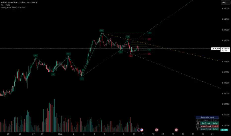
Swing elite Trend directionSwing elite Trend direction
A comprehensive market structure indicator that identifies swing highs/lows, labels them with HH/HL/LH/LL structure, draws dynamic trendlines, and provides multi-timeframe trend analysis.
🔹 FEATURES
Market Structure Analysis
Automatically detects swing highs and swing lows
Labels each pivot with its structure type: HH (Higher High), HL (Higher Low), LH (Lower High), LL (Lower Low)
Color-coded zigzag lines based on confirmed trend direction
Structure Trendlines
Downtrend Line: Connects HH to LH (resistance in bearish structure)
Uptrend Line: Connects LL to HL (support in bullish structure)
Extended projection for potential future price interaction
Swing Trendlines
Connects the last 2 swing highs (resistance trendline)
Connects the last 2 swing lows (support trendline)
Optional extension to project future levels
Break Levels
Horizontal lines at key structure points (HH, HL, LL, LH)
Visual reference for potential breakout/breakdown levels
Customizable colors for bullish and bearish breaks
Fibonacci Retracement
Auto-drawn between the last two pivots
Customizable levels: 0, 0.236, 0.382, 0.5, 0.618, 0.786, 1.0
Individual toggle and color settings for each level
Multi-Timeframe Dashboard
Displays trend status across 3 customizable timeframes
Shows trend direction: Bullish / Bearish / Neutral
Shows confirmation status: Confirmed / Unconfirmed
Color-coded for quick visual analysis
Trend Confirmation Logic (ICT/SMC Concepts)
Bullish Confirmed: HL followed by HH (Higher Low → Higher High pattern)
Bearish Confirmed: LH followed by LL (Lower High → Lower Low pattern)
Unconfirmed: Counter-structure appears (potential reversal signal)
🔹 SETTINGS
Swing Settings
Depth: Lookback period for pivot detection
Display
Toggle zigzag lines, labels, price on labels
Adjust label size and number of visible swings
Zigzag Settings
Line style: Solid, Dashed, Dotted
Thickness and colors for bullish/bearish trends
Swing Trendlines
Toggle high/low trendlines independently
Customizable colors, style, thickness
Option to extend trendlines
Structure Trendlines
Toggle HH→LH and LL→HL lines independently
Customizable colors, style, thickness
Option to extend trendlines
Break Levels
Toggle HH, HL, LL, LH break levels independently
Customizable colors for each level
Fibonacci
Toggle individual fib levels
Customizable colors and line style
Dashboard
Position: Top Left, Top Right, Bottom Left, Bottom Right
Size: Tiny, Small, Normal, Large
3 customizable timeframes
🔹 ALERTS
HH Broken: Price breaks above recent Higher High
HL Broken: Price breaks below recent Higher Low
LL Broken: Price breaks below recent Lower Low
LH Broken: Price breaks above recent Lower High
🔹 USE CASES
✅ Identify market structure and trend direction
✅ Spot potential trend reversals (unconfirmed status)
✅ Find key support/resistance levels
✅ Multi-timeframe trend alignment for trade confirmation
✅ Breakout/breakdown trading with break levels
✅ Fibonacci retracement entries
ICT Fair Value Gap Detector [Eˣ]⚡ Fair Value Gap Detector
Overview
The Fair Value Gap Detector automatically identifies price imbalances on your charts - the inefficiencies left behind when price moves too quickly. This indicator reveals where price is likely to return for "rebalancing", based on ICT (Inner Circle Trader) concepts of market efficiency.
━━━━━━━━━━━━━━━━━━━━━━━━━━━━
🎯 What This Indicator Does
Detects Fair Value Gaps:
• 🟢 Bullish FVG - Gap left below during aggressive upward move
• 🔴 Bearish FVG - Gap left above during aggressive downward move
• Automatically identifies 3-candle price inefficiencies
• Works on all timeframes and instruments
Smart Fill Tracking:
• Full Fill - Price completely fills the gap
• 50% Fill - Price fills half the gap (critical level)
• Partial Fill - Price touches gap edge
• Real-time fill percentage tracking
• Auto-removes filled gaps (optional)
Professional Features:
• Active Gap Highlighting - Shows nearest unfilled gap
• Distance Calculator - Displays how far price is from gaps
• Market Bias - Analysis based on gap balance
• Size Filtering - Minimum gap size to avoid noise
• Visual Clarity - Clean boxes with color-coding
━━━━━━━━━━━━━━━━━━━━━━━━━━━━
📚 Understanding Fair Value Gaps
What Are Fair Value Gaps?
Fair Value Gaps (FVGs), also known as imbalances or inefficiencies, are zones where price moved so quickly that normal trading didn't occur. They represent:
• Price Imbalance - One-sided aggressive buying or selling
• Unfair Pricing - Some participants didn't get to trade at these levels
• Market Inefficiency - Supply/demand equilibrium was disrupted
• Rebalancing Zones - Price often returns to "fill" these gaps
The ICT Concept:
Markets constantly seek equilibrium (fair value). When price moves too fast:
1. It leaves gaps where normal trading didn't happen
2. These gaps represent unfair/inefficient pricing
3. Market has a tendency to return and "rebalance"
4. Smart money knows this and trades the fills
Why FVGs Work:
• Unfilled Orders - Traders who missed the move have pending orders in the gap
• Algorithmic Trading - Algos programmed to exploit inefficiencies
• Market Psychology - Traders notice gaps and place orders there
• Institutional Behavior - Smart money uses gaps for entries/exits
FVG vs Regular Gaps:
• Regular Gaps - Occur at market open, between daily closes
• Fair Value Gaps - Occur intraday, between 3 consecutive candles
• FVGs happen more frequently and on all timeframes
• FVGs are more tradeable for intraday/swing traders
━━━━━━━━━━━━━━━━━━━━━━━━━━━━
🟢 Bullish Fair Value Gaps Explained
How They Form:
Bullish FVG requires 3 candles:
1. Candle 1 - Any candle (sets the high reference)
2. Candle 2 - Strong bullish candle (aggressive buying)
3. Candle 3 - Continuation candle
The Gap: Candle 3's LOW is above Candle 1's HIGH = Gap left unfilled
Visual Example:
```
Candle 3: Low at $105 ──────────┐
│ ← GAP (Bullish FVG)
Candle 2: Strong bullish │
│
Candle 1: High at $100 ──────────┘
```
What It Means:
• Price jumped from $100 to $105+ so fast, no trading occurred in between
• This $100-$105 zone is "unfair" - buyers/sellers didn't get to trade there
• Market may return to this zone to "rebalance"
• When price returns, it often acts as support
Trading Bullish FVGs:
Strategy:
• Wait for price to retrace down into the bullish FVG (green box)
• Look for rejection/bounce from the gap zone
• Enter long when price respects the FVG as support
• Stop loss: Below the FVG
• Target: Previous high or opposite FVG
Best Entry Points:
• 50% Fill: Price enters middle of gap (highest probability)
• Full Fill: Price touches bottom of gap (aggressive entry)
• Tap & Reject: Price quickly enters and exits gap (strong signal)
Example Trade:
• Bullish FVG forms: $50,000 - $50,500 (500 point gap)
• Price rallies to $52,000 then retraces
• Price drops to $50,250 (50% of gap filled)
• Bullish reversal candle appears
• Enter long at $50,500, stop at $49,800
• Target: $52,000+
━━━━━━━━━━━━━━━━━━━━━━━━━━━━
🔴 Bearish Fair Value Gaps Explained
How They Form:
Bearish FVG requires 3 candles:
1. Candle 1 - Any candle (sets the low reference)
2. Candle 2 - Strong bearish candle (aggressive selling)
3. Candle 3 - Continuation candle
The Gap: Candle 3's HIGH is below Candle 1's LOW = Gap left unfilled
Visual Example:
```
Candle 1: Low at $100 ───────────┐
│ ← GAP (Bearish FVG)
Candle 2: Strong bearish │
│
Candle 3: High at $95 ───────────┘
```
What It Means:
• Price dropped from $100 to $95 so fast, no trading occurred in between
• This $95-$100 zone is "unfair" - buyers/sellers didn't get to trade there
• Market may return to this zone to "rebalance"
• When price returns, it often acts as resistance
Trading Bearish FVGs:
Strategy:
• Wait for price to retrace up into the bearish FVG (red box)
• Look for rejection/reversal from the gap zone
• Enter short when price respects the FVG as resistance
• Stop loss: Above the FVG
• Target: Previous low or opposite FVG
Best Entry Points:
• 50% Fill: Price enters middle of gap (highest probability)
• Full Fill: Price touches top of gap (aggressive entry)
• Tap & Reject: Price quickly enters and exits gap (strong signal)
Example Trade:
• Bearish FVG forms: $48,000 - $48,500 (500 point gap)
• Price drops to $46,000 then retraces
• Price rallies to $48,250 (50% of gap filled)
• Bearish reversal candle appears
• Enter short at $48,000, stop at $48,700
• Target: $46,000-
━━━━━━━━━━━━━━━━━━━━━━━━━━━━
📊 How To Use This Indicator
Strategy 1: FVG Rebalancing (Classic)
Best For: Swing trading, reversal trading
Timeframes: 15min, 1H, 4H
Win Rate: 65-75%
Entry Rules:
1. Identify unfilled FVG (bright color, not gray)
2. Wait for price to return to the gap
3. Best entry: 50% fill of the gap
4. Look for reversal confirmation:
• Bullish FVG: Pin bar, engulfing, hammer
• Bearish FVG: Shooting star, bearish engulfing
5. Enter when price bounces/rejects from FVG
6. Stop: Beyond opposite side of FVG
7. Target: 2-3R or previous high/low
Why It Works: 70%+ of FVGs get filled, and 60%+ show reaction
Strategy 2: FVG + Order Block Confluence
Best For: High-probability setups
Timeframes: 1H, 4H
Win Rate: 75-85%
Entry Rules:
1. Find FVG that overlaps with Order Block
2. This creates a "super zone" of confluence
3. Wait for price to return to this zone
4. Enter on first touch of confluence zone
5. Stop: Beyond the confluence zone
6. Target: 3-4R
Why It Works: Double institutional concepts = highest probability
Strategy 3: Multi-Timeframe FVG
Best For: Position trading, major moves
Timeframes: Combine Daily + 4H or 4H + 1H
Win Rate: 70-80%
Entry Rules:
1. Identify large FVG on higher timeframe (Daily/4H)
2. Wait for price to enter this HTF FVG
3. Switch to lower timeframe (4H/1H)
4. Look for LTF FVG within HTF FVG in same direction
5. Trade the LTF FVG fill
6. Stop: Below LTF FVG
7. Target: Exit HTF FVG or beyond
Why It Works: Timeframe alignment = institutional consensus
Strategy 4: FVG Rejection Trade
Best For: Quick scalps, day trading
Timeframes: 5min, 15min
Win Rate: 60-70%
Entry Rules:
1. Price enters FVG zone
2. Immediate rejection (strong reversal candle)
3. Enter on close of rejection candle
4. Tight stop beyond FVG
5. Quick target: 1-2R
Why It Works: Strong rejection = institutional defense of level
Strategy 5: FVG-to-FVG Trading
Best For: Momentum trading
Timeframes: 15min, 1H
Win Rate: 55-65%
Entry Rules:
1. Identify bullish FVG below and bearish FVG above
2. Enter long at bullish FVG, target bearish FVG
3. Or enter short at bearish FVG, target bullish FVG
4. Price often moves from one imbalance to another
5. Stop: Beyond trading FVG
6. Target: Opposite FVG
Why It Works: Price rebalances from one inefficiency to another
━━━━━━━━━━━━━━━━━━━━━━━━━━━━
⚙️ Settings Explained
Display Settings
Show Bullish/Bearish FVG
• Toggle each type on/off independently
• Customize colors for each FVG type
• Default: Green (bullish), Red (bearish)
• Tip: Use colors that contrast with your chart
Max FVG to Display (Default: 20)
• Limits how many gaps are shown at once
• Lower (10-15): Cleaner chart, recent gaps only
• Higher (30-50): More historical context
• Recommended: 15-25 for most trading
Show FVG Labels (Default: ON)
• Displays "FVG+" and "FVG-" text on gaps
• Shows 🎯 on active (nearest) gap
• Shows fill percentage (e.g., "FVG+ 35%")
• Turn OFF for minimal appearance
• Recommended: Keep ON for clarity
Extend Gaps (bars) (Default: 50)
• How far to extend gap boxes to the right
• Lower (20-30): Shorter boxes
• Higher (100+): Longer boxes, easier to see
• Gaps auto-extend until filled or limit reached
• Recommended: 40-60 bars
Filters
Min Gap Size % (Default: 0.05)
• Minimum gap size as percentage of price
• Filters out tiny, insignificant gaps
• Crypto: 0.05-0.15% (high volatility)
• Forex: 0.03-0.10% (moderate volatility)
• Stocks: 0.05-0.20% (varies by stock)
• Indices: 0.05-0.15%
• Adjust based on instrument's average move
Show Filled Gaps (Default: OFF)
• When ON: Shows gray boxes for filled gaps
• When OFF: Gaps disappear after mitigation
• Use ON: For learning and backtesting
• Use OFF: For clean, active trading view
Advanced Settings
Auto-Detect Mitigation (Default: ON)
• Automatically tracks when gaps are filled
• Updates fill percentage in real-time
• Marks gaps as "mitigated" when filled
• Recommended: Keep ON
Mitigation Type (Default: Full)
• Full: Gap considered filled when price closes through entire gap
• 50%: Gap considered filled at 50% (critical level)
• Partial: Gap considered filled on first touch
• For learning: Use "Full"
• For aggressive trading: Use "50%"
• For conservative trading: Use "Partial"
Highlight Nearest Gap (Default: ON)
• Highlights the closest unfilled gap to current price
• Active gap shown with 🎯 emoji and brighter color
• Helps focus on most relevant opportunity
• Recommended: Keep ON
━━━━━━━━━━━━━━━━━━━━━━━━━━━━
📱 Info Panel Guide
Bullish FVG Count
• Number of active (unfilled) bullish fair value gaps
• Higher number = More potential support zones below
• Multiple bullish FVGs = Strong rebalancing demand
Bearish FVG Count
• Number of active (unfilled) bearish fair value gaps
• Higher number = More potential resistance zones above
• Multiple bearish FVGs = Strong rebalancing supply
Bias Indicator
• ⬆ Bullish: More bullish FVGs than bearish
• ⬇ Bearish: More bearish FVGs than bullish
• ↔ Neutral: Equal FVGs on both sides
• Market tends to fill nearby gaps first
Target Indicator
• Shows nearest unfilled gap and distance
• Example: "Bull FVG -1.25%" = Bullish gap is 1.25% below price
• Example: "Bear FVG +0.85%" = Bearish gap is 0.85% above price
• Watch for price to reach these targets
━━━━━━━━━━━━━━━━━━━━━━━━━━━━
📱 Alert Setup
This indicator includes 4 alert types:
1. Price Entering Bullish FVG
• Fires when price drops into a bullish gap
• Action: Watch for bounce/reversal
• High-probability long setup developing
2. Price Entering Bearish FVG
• Fires when price rallies into a bearish gap
• Action: Watch for rejection/reversal
• High-probability short setup developing
3. New Bullish FVG Detected
• Fires when a new bullish gap forms
• Action: Mark zone for future fill
• New rebalancing target below identified
4. New Bearish FVG Detected
• Fires when a new bearish gap forms
• Action: Mark zone for future fill
• New rebalancing target above identified
To Set Up Alerts:
1. Click "Alert" button (clock icon)
2. Select "Fair Value Gap Detector"
3. Choose your alert condition
4. Configure notification method
5. Click "Create"
Pro Tip: Set "Price Entering" alerts to catch fills in real-time
━━━━━━━━━━━━━━━━━━━━━━━━━━━━
💎 Pro Tips & Best Practices
✅ DO:
• Wait for 50% fill - Middle of gap has highest win rate (65-70%)
• Use confirmation - Don't trade just because price touched gap
• Combine with structure - FVG + support/resistance = high probability
• Trade first fill - Unfilled gaps have better success rate than refilled
• Respect full fills - Once fully filled, gap is less reliable
• Use multiple timeframes - HTF FVGs are stronger than LTF
• Check session timing - FVGs work best during London/NY sessions
• Follow the bias - More bullish FVGs = favor longs
⚠️ DON'T:
• Don't blindly fade gaps - Wait for price action confirmation
• Don't ignore momentum - Strong trends can blow through FVGs
• Don't trade every gap - Quality over quantity
• Don't assume all gaps fill - About 70-80% fill, 20-30% don't
• Don't use tight stops - Allow room for wick into gap
• Don't overtrade - Wait for confluence and confirmation
• Don't fight trends - Best FVG trades are with higher TF trend
• Don't ignore fill percentage - 50% is often the sweet spot
🎯 Best Timeframes:
• Scalpers: 1min, 5min (many gaps, quick fills)
• Day Traders: 5min, 15min, 1H (balanced)
• Swing Traders: 1H, 4H, Daily (larger, more reliable gaps)
• Position Traders: 4H, Daily, Weekly (major imbalances)
🔥 Best Instruments:
• Excellent: BTC, ETH, ES, NQ, Forex majors (clean price action)
• Good: Gold, Oil, Major indices, Large-cap stocks
• Moderate: Altcoins, small-cap stocks (more noise)
• Best Markets: Trending markets with clear swings
⏰ Best Times for FVG Trading:
• London Session: High volume = reliable gap fills
• NY Session: Strong moves create quality gaps
• London-NY Overlap: Best time for gap creation and fills
• Asian Session: Lower probability, wait for London
━━━━━━━━━━━━━━━━━━━━━━━━━━━━
🎓 Advanced FVG Concepts
FVG Mitigation Levels
Understanding fill percentages:
• 0-25% Fill: Gap barely touched, often continues without fill
• 25-50% Fill: Partial rebalancing, may reverse here
• 50% Fill: CRITICAL LEVEL - Highest probability reversal zone
• 50-75% Fill: Deep rebalancing, strong reversal likely
• 75-100% Fill: Full rebalancing, gap's purpose fulfilled
Why 50% Matters: Market seeks equilibrium, and 50% represents perfect balance
FVG Inversions
When price breaks through a gap completely:
• Bullish FVG that's broken becomes bearish (support → resistance)
• Bearish FVG that's broken becomes bullish (resistance → support)
• Inverted gaps are weaker than fresh gaps
• Trading: Can fade the inverted gap but with caution
FVG Confluence Zones
Multiple FVGs at similar level:
• Creates "super gap" or confluence zone
• Much higher probability of reaction
• Wider zone for entries (more room for stops)
• Often aligns with other institutional concepts
FVG + Order Block Combo
When FVG overlaps with Order Block:
• Double institutional concept
• Extremely high probability setup (75-85% win rate)
• Price drawn to fill gap AND test order block
• Use tight stops, generous targets (3-5R possible)
Nested FVGs (Multi-Timeframe)
Small FVG inside larger FVG:
• Daily FVG contains 4H FVG contains 1H FVG
• Trade the smallest FVG in direction of larger ones
• Highest probability when all aligned
• Progressive targets: Fill small → medium → large gaps
FVG Exhaustion
When price creates multiple FVGs in same direction:
• Indicates strong momentum/impulsive move
• Each gap represents acceleration
• Last gap often signals exhaustion
• Watch for reversal after filling final gap
━━━━━━━━━━━━━━━━━━━━━━━━━━━━
📈 Common FVG Patterns
Pattern 1: The Perfect Rebalance
• FVG forms during strong move
• Price continues 100+ pips
• Clean return to 50% of gap
• Immediate reversal
• Textbook setup, 70%+ win rate
Pattern 2: The Double Fill
• Price partially fills gap (25%)
• Weak reaction, continues
• Returns again for deeper fill (75%)
• Strong reversal on second fill
• Second fill often better entry
Pattern 3: The Blow-Through
• Price approaches gap
• Completely ignores it, no reaction
• Keeps going in same direction
• Sign of very strong momentum
Pattern 4: The Magnet Effect
• Price slowly grinds toward gap
• Accelerates as it gets close
• Quickly fills and reverses
• Common in ranging markets
Pattern 5: The False Fill
• Price wicks into gap briefly
• Immediately reverses without filling
• "Stop hunt" or liquidity grab
• Gap remains unfilled
• Often precedes strong move
━━━━━━━━━━━━━━━━━━━━━━━━━━━━
🚀 What Makes This Different?
Unlike basic gap indicators, Fair Value Gap Detector:
• ICT Methodology - Based on proven institutional concepts
• Real-Time Fill Tracking - Shows percentage filled as it happens
• 3 Mitigation Types - Full, 50%, Partial for different strategies
• Active Gap Highlighting - Shows most relevant opportunity
• Smart Filtering - Minimum size to avoid noise
• Visual Clarity - Clean, professional appearance
• Auto-Management - Removes filled gaps automatically
• Distance Tracking - Know exactly where price needs to go
Based On Professional Concepts:
• ICT Fair Value Gap theory
• Market efficiency principles
• Price rebalancing dynamics
• Institutional order flow analysis
━━━━━━━━━━━━━━━━━━━━━━━━━━━━
📈 FVG Statistics & Probabilities
Based on ICT concepts and trader observations:
Gap Fill Rates:
• 70-80% of FVGs get filled eventually
• 60-70% show some reaction when filled
• 50% fill level has ~65% reversal rate
• Full fills have ~55% reversal rate
Timeframe Reliability:
• Daily FVGs: ~75-85% fill rate, strongest reactions
• 4H FVGs: ~70-80% fill rate, strong reactions
• 1H FVGs: ~65-75% fill rate, good reactions
• 15min FVGs: ~60-70% fill rate, moderate reactions
• 5min FVGs: ~55-65% fill rate, weaker reactions
Best Practices:
• First touch of gap = 65-70% win rate
• 50% fill = 65% win rate
• FVG + Order Block = 75-85% win rate
• Multi-timeframe aligned FVG = 70-80% win rate
• FVG in trending market = 60-70% win rate
Common Failures:
• Strong momentum blows through gaps (20-30% of time)
• Gaps in low-volume periods less reliable
• Very small gaps (<0.05%) often ignored
• Counter-trend gaps have lower success rate
━━━━━━━━━━━━━━━━━━━━━━━━━━━━
🙏 If You Find This Helpful
• ⭐ Leave your feedback
• 💬 Share your experience in the comments
• 🔔 Follow for updates and new tools
Questions about Fair Value Gaps? Feel free to ask in the comments.
━━━━━━━━━━━━━━━━━━━━━━━━━━━━
Version History
• v1.0 - Initial release with 3-candle FVG detection and real-time fill tracking

Cold Brew Ranges🧭 Core Logic and Calculation
The fundamental logic for each range (OR and CR) is identical:
Time Definition: Each range is defined by a specific Start Time and a fixed 30-second duration. The timestamp function, using the "America/New_York" time zone, is used to calculate the exact start time in Unix milliseconds for the current day.
Example: t0200 = timestamp(TZ, yC, mC, dC, 2, 0, 0) sets the start time for the 02:00 OR to 2:00:00 AM NY time.
Range Data Collection: The indicator uses the request.security_lower_tf() function to collect the High (hArr) and Low (lArr) prices of all bars that fall within the defined 30-second window, using a user-specified, sub-chart-timeframe (openrangetime, defaulted to "1" second, "30S", or "5" minutes). This ensures high precision in capturing the exact high and low during the 30-second window.
High/Low Determination: It iteratively finds the absolute highest price (OR_high) and the absolute lowest price (OR_low) recorded by the bars during that 30-second window.
Range Locking: Once the current chart bar's time (lastTs) passes the 30-second End Time (tEnd), the High and Low are locked (OR_locked = true), meaning the range calculation is complete for the day.
Drawing: Upon locking, the range is drawn on the chart using line.new for the High, Low, and Equilibrium, and box.new for the shaded fill. The lines are extended to a subsequent time anchor point (e.g., the 02:00 OR is extended to 08:20, the 09:30 OR is extended to 16:00).
Equilibrium (EQ): This is calculated as the simple average (midpoint) of the High and Low of the range.
EQ=
2
OR_High+OR_Low
⏰ Defined Trading Ranges
The indicator defines and tracks the following specific 30-second ranges:
Range Name Type Start Time (NY) Line Extension End Time (NY) Common Market Context
02:00 OR Opening 02:00:00 08:20:00 Asian/European Market Overlap
08:20 OR Opening 08:20:00 16:00:00 Pre-New York Open
09:30 OR Opening 09:30:00 16:00:00 New York Stock Exchange Open (Most significant OR)
18:00 OR Opening 18:00:00 20:00:00 Futures Market Open (Sunday/Monday)
20:00 OR Opening 20:00:00 Next Day's session start Asian Session Start
15:50 CR Closing 15:50:00 20:00:00 New York Close Range
⚙️ Key User Inputs and Customization
The script offers extensive control over which ranges are displayed and how they are visualized:
Range Time & History
openrangetime: Sets the sub-timeframe (e.g., "1" for 1 second) used to calculate the precise High/Low of the 30-second range. Crucial for accuracy.
showHistory: A toggle to show the ranges from previous days (up to a histCap of 50 days).
Range Toggles and Styling
On/Off Toggles: Independent input.bool (e.g., OR_0200_on) to enable or disable the display of each individual range.
Colors & Width: Separate color and width inputs for the High/Low lines (hlC), the Equilibrium line (eqC), and the background fill (fillC) for each range.
Line Styles: Global inputs for the line styles of High/Low (lineStyleInput) and Equilibrium (eqLineStyleInput) lines (Solid, Dotted, or Dashed).
showFill: Global toggle to enable the shaded background box that highlights the area between the High and Low.
Extensions
The script calculates and plots extensions (multiples of the initial range) above the High and below the Low.
showExt: Toggles the visibility of the extension lines.
useRangeMultiples: If true, the step size for each extension level is equal to the initial range size:
Step=Range=OR_High−OR_Low
If false, the step size is a fixed value defined by stepPts (e.g., 60.0 points, which is a common value for NQ futures).
stepCnt: Determines how many extension levels (multiples) are drawn above and below the range (default is 10).
📈 Trading Strategy Implications
The Cold Brew Ranges indicator is a tool for session-based support and resistance and range breakout/reversal strategies.
Key Support/Resistance: The High and Low of these defined opening ranges often act as strong, predefined price levels. Traders look for price rejection off these boundaries or a breakout with conviction.
Equilibrium (Midpoint): The EQ often represents a fair value for that specific session's opening. Movements away from it are seen as opportunities, and a return to it is common.
Extensions: The range extensions serve as potential profit targets or stronger, layered support/resistance levels if the market trends aggressively after the opening range is set.
The core idea is that the activity in the first 30 seconds of a significant trading session (like the NYSE or a market session open) sets a bias and initial boundary for the trading period that follows.

Session Highs and Lows🔑 Key Levels: Session Liquidity & Structure Mapper
The Key Levels indicator is an essential tool for traders as it automatically plots and projects critical Highs and Lows established during key trading sessions. These levels represent major liquidity pools and define the current market structure, serving as high-probability targets, support, or resistance for the remainder of the trading day.
⚙️ Core Functionality
The indicator operates in two distinct modes, tailored for different asset classes:
1. Asset Class Mode (Toggle)
You can switch between two predefined setups depending on the asset you are trading:
Stock Mode (RTH/ETH): Designed for US stocks and futures (e.g., NQ, ES, YM). It tracks and projects levels for Regular Trading Hours (RTH) (09:30-16:00) and Extended Hours (ETH) (16:00-09:30).
Forex/Default Mode (Asia/London/NY): Designed for global markets (e.g., currency pairs). It tracks and projects levels for the three major liquidity sessions: Asia (19:00-03:00), London (03:00-09:30), and New York (09:30-16:00).
🗺️ Key Levels Mapped
The script continuously tracks and plots the most significant structural levels:
Current Session High/Low: The running high and low of the currently active session.
Previous Session High/Low: The confirmed high and low from the most recently completed session. These are often targeted by market makers.
Previous Day High/Low (PDH/PDL): The high and low of the prior 24-hour day, acting as major structural boundaries and a crucial macro market filter.
🎛️ Advanced Liquidity Management
The indicator is built with specific controls for high-level liquidity analysis:
Extend Through Sweeps (Critical Setting):
OFF (Recommended): The projected line is automatically stopped or deleted the moment the price candle wicks or closes past it. This visually confirms that the liquidity at that level has been "swept" or "mitigated."
ON: The line extends indefinitely, treating the level as simple support/resistance, regardless of interaction.
Previous vs. Current View: You can select a checkbox (e.g., Use PREVIOUS London Level) to hide the current session's running levels and only display the static, confirmed high/low from the prior completed session. This helps declutter the chart and focus only on the confirmed structural levels.
Show Older History: Toggle to keep lines from prior days visible, allowing you to track multi-day structural context.
🎯 Trading Application
The lines plotted by the Key Levels indicator provide immediate, actionable information:
Bias Filter: Use the PDH/PDL to determine the overall market context. Trading above the PDH suggests a bullish bias, while trading below the PDL suggests a bearish bias.
Manipulation/Entry: Wait for price to aggressively sweep a Previous Session High/Low (line stops extending). This often signals a liquidity grab or "manipulation" phase. Look for entries in the opposite direction for the main move (Distribution).
Targets: Key levels (especially unmitigated ones) serve as excellent, objective take-profit targets for active trades.

Volatility Risk PremiumTHE INSURANCE PREMIUM OF THE STOCK MARKET
Every day, millions of investors face a fundamental question that has puzzled economists for decades: how much should protection against market crashes cost? The answer lies in a phenomenon called the Volatility Risk Premium, and understanding it may fundamentally change how you interpret market conditions.
Think of the stock market like a neighborhood where homeowners buy insurance against fire. The insurance company charges premiums based on their estimates of fire risk. But here is the interesting part: insurance companies systematically charge more than the actual expected losses. This difference between what people pay and what actually happens is the insurance premium. The same principle operates in financial markets, but instead of fire insurance, investors buy protection against market volatility through options contracts.
The Volatility Risk Premium, or VRP, measures exactly this difference. It represents the gap between what the market expects volatility to be (implied volatility, as reflected in options prices) and what volatility actually turns out to be (realized volatility, calculated from actual price movements). This indicator quantifies that gap and transforms it into actionable intelligence.
THE FOUNDATION
The academic study of volatility risk premiums began gaining serious traction in the early 2000s, though the phenomenon itself had been observed by practitioners for much longer. Three research papers form the backbone of this indicator's methodology.
Peter Carr and Liuren Wu published their seminal work "Variance Risk Premiums" in the Review of Financial Studies in 2009. Their research established that variance risk premiums exist across virtually all asset classes and persist over time. They documented that on average, implied volatility exceeds realized volatility by approximately three to four percentage points annualized. This is not a small number. It means that sellers of volatility insurance have historically collected a substantial premium for bearing this risk.
Tim Bollerslev, George Tauchen, and Hao Zhou extended this research in their 2009 paper "Expected Stock Returns and Variance Risk Premia," also published in the Review of Financial Studies. Their critical contribution was demonstrating that the VRP is a statistically significant predictor of future equity returns. When the VRP is high, meaning investors are paying substantial premiums for protection, future stock returns tend to be positive. When the VRP collapses or turns negative, it often signals that realized volatility has spiked above expectations, typically during market stress periods.
Gurdip Bakshi and Nikunj Kapadia provided additional theoretical grounding in their 2003 paper "Delta-Hedged Gains and the Negative Market Volatility Risk Premium." They demonstrated through careful empirical analysis why volatility sellers are compensated: the risk is not diversifiable and tends to materialize precisely when investors can least afford losses.
HOW THE INDICATOR CALCULATES VOLATILITY
The calculation begins with two separate measurements that must be compared: implied volatility and realized volatility.
For implied volatility, the indicator uses the CBOE Volatility Index, commonly known as the VIX. The VIX represents the market's expectation of 30-day forward volatility on the S&P 500, calculated from a weighted average of out-of-the-money put and call options. It is often called the "fear gauge" because it rises when investors rush to buy protective options.
Realized volatility requires more careful consideration. The indicator offers three distinct calculation methods, each with specific advantages rooted in academic literature.
The Close-to-Close method is the most straightforward approach. It calculates the standard deviation of logarithmic daily returns over a specified lookback period, then annualizes this figure by multiplying by the square root of 252, the approximate number of trading days in a year. This method is intuitive and widely used, but it only captures information from closing prices and ignores intraday price movements.
The Parkinson estimator, developed by Michael Parkinson in 1980, improves efficiency by incorporating high and low prices. The mathematical formula calculates variance as the sum of squared log ratios of daily highs to lows, divided by four times the natural logarithm of two, times the number of observations. This estimator is theoretically about five times more efficient than the close-to-close method because high and low prices contain additional information about the volatility process.
The Garman-Klass estimator, published by Mark Garman and Michael Klass in 1980, goes further by incorporating opening, high, low, and closing prices. The formula combines half the squared log ratio of high to low prices minus a factor involving the log ratio of close to open. This method achieves the minimum variance among estimators using only these four price points, making it particularly valuable for markets where intraday information is meaningful.
THE CORE VRP CALCULATION
Once both volatility measures are obtained, the VRP calculation is straightforward: subtract realized volatility from implied volatility. A positive result means the market is paying a premium for volatility insurance. A negative result means realized volatility has exceeded expectations, typically indicating market stress.
The raw VRP signal receives slight smoothing through an exponential moving average to reduce noise while preserving responsiveness. The default smoothing period of five days balances signal clarity against lag.
INTERPRETING THE REGIMES
The indicator classifies market conditions into five distinct regimes based on VRP levels.
The EXTREME regime occurs when VRP exceeds ten percentage points. This represents an unusual situation where the gap between implied and realized volatility is historically wide. Markets are pricing in significantly more fear than is materializing. Research suggests this often precedes positive equity returns as the premium normalizes.
The HIGH regime, between five and ten percentage points, indicates elevated risk aversion. Investors are paying above-average premiums for protection. This often occurs after market corrections when fear remains elevated but realized volatility has begun subsiding.
The NORMAL regime covers VRP between zero and five percentage points. This represents the long-term average state of markets where implied volatility modestly exceeds realized volatility. The insurance premium is being collected at typical rates.
The LOW regime, between negative two and zero percentage points, suggests either unusual complacency or that realized volatility is catching up to implied volatility. The premium is shrinking, which can precede either calm continuation or increased stress.
The NEGATIVE regime occurs when realized volatility exceeds implied volatility. This is relatively rare and typically indicates active market stress. Options were priced for less volatility than actually occurred, meaning volatility sellers are experiencing losses. Historically, deeply negative VRP readings have often coincided with market bottoms, though timing the reversal remains challenging.
TERM STRUCTURE ANALYSIS
Beyond the basic VRP calculation, sophisticated market participants analyze how volatility behaves across different time horizons. The indicator calculates VRP using both short-term (default ten days) and long-term (default sixty days) realized volatility windows.
Under normal market conditions, short-term realized volatility tends to be lower than long-term realized volatility. This produces what traders call contango in the term structure, analogous to futures markets where later delivery dates trade at premiums. The RV Slope metric quantifies this relationship.
When markets enter stress periods, the term structure often inverts. Short-term realized volatility spikes above long-term realized volatility as markets experience immediate turmoil. This backwardation condition serves as an early warning signal that current volatility is elevated relative to historical norms.
The academic foundation for term structure analysis comes from Scott Mixon's 2007 paper "The Implied Volatility Term Structure" in the Journal of Derivatives, which documented the predictive power of term structure dynamics.
MEAN REVERSION CHARACTERISTICS
One of the most practically useful properties of the VRP is its tendency to mean-revert. Extreme readings, whether high or low, tend to normalize over time. This creates opportunities for systematic trading strategies.
The indicator tracks VRP in statistical terms by calculating its Z-score relative to the trailing one-year distribution. A Z-score above two indicates that current VRP is more than two standard deviations above its mean, a statistically unusual condition. Similarly, a Z-score below negative two indicates VRP is unusually low.
Mean reversion signals trigger when VRP reaches extreme Z-score levels and then shows initial signs of reversal. A buy signal occurs when VRP recovers from oversold conditions (Z-score below negative two and rising), suggesting that the period of elevated realized volatility may be ending. A sell signal occurs when VRP contracts from overbought conditions (Z-score above two and falling), suggesting the fear premium may be excessive and due for normalization.
These signals should not be interpreted as standalone trading recommendations. They indicate probabilistic conditions based on historical patterns. Market context and other factors always matter.
MOMENTUM ANALYSIS
The rate of change in VRP carries its own information content. Rapidly rising VRP suggests fear is building faster than volatility is materializing, often seen in the early stages of corrections before realized volatility catches up. Rapidly falling VRP indicates either calming conditions or rising realized volatility eating into the premium.
The indicator tracks VRP momentum as the difference between current VRP and VRP from a specified number of bars ago. Positive momentum with positive acceleration suggests strengthening risk aversion. Negative momentum with negative acceleration suggests intensifying stress or rapid normalization from elevated levels.
PRACTICAL APPLICATION
For equity investors, the VRP provides context for risk management decisions. High VRP environments historically favor equity exposure because the market is pricing in more pessimism than typically materializes. Low or negative VRP environments suggest either reducing exposure or hedging, as markets may be underpricing risk.
For options traders, understanding VRP is fundamental to strategy selection. Strategies that sell volatility, such as covered calls, cash-secured puts, or iron condors, tend to profit when VRP is elevated and compress toward its mean. Strategies that buy volatility tend to profit when VRP is low and risk materializes.
For systematic traders, VRP provides a regime filter for other strategies. Momentum strategies may benefit from different parameters in high versus low VRP environments. Mean reversion strategies in VRP itself can form the basis of a complete trading system.
LIMITATIONS AND CONSIDERATIONS
No indicator provides perfect foresight, and the VRP is no exception. Several limitations deserve attention.
The VRP measures a relationship between two estimates, each subject to measurement error. The VIX represents expectations that may prove incorrect. Realized volatility calculations depend on the chosen method and lookback period.
Mean reversion tendencies hold over longer time horizons but provide limited guidance for short-term timing. VRP can remain extreme for extended periods, and mean reversion signals can generate losses if the extremity persists or intensifies.
The indicator is calibrated for equity markets, specifically the S&P 500. Application to other asset classes requires recalibration of thresholds and potentially different data sources.
Historical relationships between VRP and subsequent returns, while statistically robust, do not guarantee future performance. Structural changes in markets, options pricing, or investor behavior could alter these dynamics.
STATISTICAL OUTPUTS
The indicator presents comprehensive statistics including current VRP level, implied volatility from VIX, realized volatility from the selected method, current regime classification, number of bars in the current regime, percentile ranking over the lookback period, Z-score relative to recent history, mean VRP over the lookback period, realized volatility term structure slope, VRP momentum, mean reversion signal status, and overall market bias interpretation.
Color coding throughout the indicator provides immediate visual interpretation. Green tones indicate elevated VRP associated with fear and potential opportunity. Red tones indicate compressed or negative VRP associated with complacency or active stress. Neutral tones indicate normal market conditions.
ALERT CONDITIONS
The indicator provides alerts for regime transitions, extreme statistical readings, term structure inversions, mean reversion signals, and momentum shifts. These can be configured through the TradingView alert system for real-time monitoring across multiple timeframes.
REFERENCES
Bakshi, G., and Kapadia, N. (2003). Delta-Hedged Gains and the Negative Market Volatility Risk Premium. Review of Financial Studies, 16(2), 527-566.
Bollerslev, T., Tauchen, G., and Zhou, H. (2009). Expected Stock Returns and Variance Risk Premia. Review of Financial Studies, 22(11), 4463-4492.
Carr, P., and Wu, L. (2009). Variance Risk Premiums. Review of Financial Studies, 22(3), 1311-1341.
Garman, M. B., and Klass, M. J. (1980). On the Estimation of Security Price Volatilities from Historical Data. Journal of Business, 53(1), 67-78.
Mixon, S. (2007). The Implied Volatility Term Structure of Stock Index Options. Journal of Empirical Finance, 14(3), 333-354.
Parkinson, M. (1980). The Extreme Value Method for Estimating the Variance of the Rate of Return. Journal of Business, 53(1), 61-65.

MTF S/R Array - Full CustomA clean, institutional-style multi-timeframe support and resistance indicator designed for precision trading decisions. Plots previous and current period levels with full customization for backtesting and live trading.
━━━━━━━━━━━━━━━━━━━━━━
WHAT IT PLOTS
━━━━━━━━━━━━━━━━━━━━━━
MONTHLY
- Previous Month High / Low / Close
- Previous Month Highest Closing Price
- Current Month High / Low / Highest Close
WEEKLY
- Previous Week High / Low / Close
- Current Week High / Low
DAILY
- Previous Day High / Low / Close
- Current Day High / Low
SESSIONS (Full Session - EST)
- Asian: 7pm - 4am
- London: 3am - 12pm
- New York: 8am - 5pm
OPENING RANGE
- Monday/Tuesday combined high and low
- Clean box visualization for weekly initial balance
━━━━━━━━━━━━━━━━━━━━━━
WHY THESE LEVELS MATTER
━━━━━━━━━━━━━━━━━━━━━━
Institutions and smart money reference these key levels for:
- Liquidity targets
- Stop hunts
- Reversal zones
- Trend continuation entries
Previous period levels act as magnets for price. Current levels show where the battle is happening now.
━━━━━━━━━━━━━━━━━━━━━━
FULL CUSTOMIZATION
━━━━━━━━━━━━━━━━━━━━━━
Every level type has independent controls:
- Show/Hide Previous and Current separately
- Extend Bars - control how far each level stretches
- Line Width - adjust thickness per level
- Transparency - fade previous levels for clarity
- Colors - separate colors for High/Low vs Close
Additional settings:
- Labels on/off with size and style options
- Info table with position and size controls
- Opening range box transparency and border width
━━━━━━━━━━━━━━━━━━━━━━
HOW TO USE
━━━━━━━━━━━━━━━━━━━━━━
1. Use on lower timeframes (1m, 5m, 15m) to see HTF levels
2. Watch for price reactions at previous period highs/lows
3. Look for session high/low sweeps followed by reversals
4. Use Monday/Tuesday opening range for weekly bias and targets
5. Previous levels extend further back for backtesting context
━━━━━━━━━━━━━━━━━━━━━━
TIPS
━━━━━━━━━━━━━━━━━━━━━━
- Increase "Prev Extend Bars" on monthly/weekly to see levels across more history
- Use higher transparency on previous levels to keep chart clean
- Turn off sessions you don't trade to reduce clutter
- The info table shows all values at a glance - position it where it doesn't block price action
━━━━━━━━━━━━━━━━━━━━━━
BEST FOR
━━━━━━━━━━━━━━━━━━━━━━
- ICT / Smart Money Concepts traders
- Session-based strategies
- Swing traders using HTF levels on LTF entries
- Anyone who wants clean, customizable S/R levels
Works on Forex, Crypto, Stocks, Futures, and Indices.

SR & POI Indicator//@version=5
indicator(title='SR & POI Indicator', overlay=true, max_boxes_count=500, max_lines_count=500, max_labels_count=500)
//============================================================================
// SUPPLY/DEMAND & POI SETTINGS
//============================================================================
swing_length = input.int(10, title = 'Swing High/Low Length', group = 'Supply/Demand Settings', minval = 1, maxval = 50)
history_of_demand_to_keep = input.int(20, title = 'History To Keep', group = 'Supply/Demand Settings', minval = 5, maxval = 50)
box_width = input.float(2.5, title = 'Supply/Demand Box Width', group = 'Supply/Demand Settings', minval = 1, maxval = 10, step = 0.5)
show_price_action_labels = input.bool(false, title = 'Show Price Action Labels', group = 'Supply/Demand Visual Settings')
supply_color = input.color(color.new(#EDEDED,70), title = 'Supply', group = 'Supply/Demand Visual Settings', inline = '3')
supply_outline_color = input.color(color.new(color.white,75), title = 'Outline', group = 'Supply/Demand Visual Settings', inline = '3')
demand_color = input.color(color.new(#00FFFF,70), title = 'Demand', group = 'Supply/Demand Visual Settings', inline = '4')
demand_outline_color = input.color(color.new(color.white,75), title = 'Outline', group = 'Supply/Demand Visual Settings', inline = '4')
bos_label_color = input.color(color.white, title = 'BOS Label', group = 'Supply/Demand Visual Settings')
poi_label_color = input.color(color.white, title = 'POI Label', group = 'Supply/Demand Visual Settings')
swing_type_color = input.color(color.black, title = 'Price Action Label', group = 'Supply/Demand Visual Settings')
//============================================================================
// SR SETTINGS
//============================================================================
enableSR = input(true, "SR On/Off", group="SR Settings")
colorSup = input(#00DBFF, "Support Color", group="SR Settings")
colorRes = input(#E91E63, "Resistance Color", group="SR Settings")
strengthSR = input.int(2, "S/R Strength", 1, group="SR Settings")
lineStyle = input.string("Dotted", "Line Style", , group="SR Settings")
lineWidth = input.int(2, "S/R Line Width", 1, group="SR Settings")
useZones = input(true, "Zones On/Off", group="SR Settings")
useHLZones = input(true, "High Low Zones On/Off", group="SR Settings")
zoneWidth = input.int(2, "Zone Width %", 0, tooltip="it's calculated using % of the distance between highest/lowest in last 300 bars", group="SR Settings")
expandSR = input(true, "Expand SR", group="SR Settings")
//============================================================================
// SUPPLY/DEMAND FUNCTIONS
//============================================================================
// Function to add new and remove last in array
f_array_add_pop(array, new_value_to_add) =>
array.unshift(array, new_value_to_add)
array.pop(array)
// Function for swing H & L labels
f_sh_sl_labels(array, swing_type) =>
var string label_text = na
if swing_type == 1
if array.get(array, 0) >= array.get(array, 1)
label_text := 'HH'
else
label_text := 'LH'
label.new(bar_index - swing_length, array.get(array,0), text = label_text, style=label.style_label_down, textcolor = swing_type_color, color = color.new(swing_type_color, 100), size = size.tiny)
else if swing_type == -1
if array.get(array, 0) >= array.get(array, 1)
label_text := 'HL'
else
label_text := 'LL'
label.new(bar_index - swing_length, array.get(array,0), text = label_text, style=label.style_label_up, textcolor = swing_type_color, color = color.new(swing_type_color, 100), size = size.tiny)
// Function to check overlapping
f_check_overlapping(new_poi, box_array, atr) =>
atr_threshold = atr * 2
okay_to_draw = true
for i = 0 to array.size(box_array) - 1
top = box.get_top(array.get(box_array, i))
bottom = box.get_bottom(array.get(box_array, i))
poi = (top + bottom) / 2
upper_boundary = poi + atr_threshold
lower_boundary = poi - atr_threshold
if new_poi >= lower_boundary and new_poi <= upper_boundary
okay_to_draw := false
break
else
okay_to_draw := true
okay_to_draw
// Function to draw supply or demand zone
f_supply_demand(value_array, bn_array, box_array, label_array, box_type, atr) =>
atr_buffer = atr * (box_width / 10)
box_left = array.get(bn_array, 0)
box_right = bar_index
var float box_top = 0.00
var float box_bottom = 0.00
var float poi = 0.00
if box_type == 1
box_top := array.get(value_array, 0)
box_bottom := box_top - atr_buffer
poi := (box_top + box_bottom) / 2
else if box_type == -1
box_bottom := array.get(value_array, 0)
box_top := box_bottom + atr_buffer
poi := (box_top + box_bottom) / 2
okay_to_draw = f_check_overlapping(poi, box_array, atr)
if box_type == 1 and okay_to_draw
box.delete( array.get(box_array, array.size(box_array) - 1) )
f_array_add_pop(box_array, box.new( left = box_left, top = box_top, right = box_right, bottom = box_bottom, border_color = supply_outline_color,
bgcolor = supply_color, extend = extend.right, text = 'SUPPLY', text_halign = text.align_center, text_valign = text.align_center, text_color = poi_label_color, text_size = size.small, xloc = xloc.bar_index))
box.delete( array.get(label_array, array.size(label_array) - 1) )
f_array_add_pop(label_array, box.new( left = box_left, top = poi, right = box_right, bottom = poi, border_color = color.new(poi_label_color,90),
bgcolor = color.new(poi_label_color,90), extend = extend.right, text = 'POI', text_halign = text.align_left, text_valign = text.align_center, text_color = poi_label_color, text_size = size.small, xloc = xloc.bar_index))
else if box_type == -1 and okay_to_draw
box.delete( array.get(box_array, array.size(box_array) - 1) )
f_array_add_pop(box_array, box.new( left = box_left, top = box_top, right = box_right, bottom = box_bottom, border_color = demand_outline_color,
bgcolor = demand_color, extend = extend.right, text = 'DEMAND', text_halign = text.align_center, text_valign = text.align_center, text_color = poi_label_color, text_size = size.small, xloc = xloc.bar_index))
box.delete( array.get(label_array, array.size(label_array) - 1) )
f_array_add_pop(label_array, box.new( left = box_left, top = poi, right = box_right, bottom = poi, border_color = color.new(poi_label_color,90),
bgcolor = color.new(poi_label_color,90), extend = extend.right, text = 'POI', text_halign = text.align_left, text_valign = text.align_center, text_color = poi_label_color, text_size = size.small, xloc = xloc.bar_index))
// Function to change supply/demand to BOS if broken
f_sd_to_bos(box_array, bos_array, label_array, zone_type) =>
if zone_type == 1
for i = 0 to array.size(box_array) - 1
level_to_break = box.get_top(array.get(box_array,i))
if close >= level_to_break
copied_box = box.copy(array.get(box_array,i))
f_array_add_pop(bos_array, copied_box)
mid = (box.get_top(array.get(box_array,i)) + box.get_bottom(array.get(box_array,i))) / 2
box.set_top(array.get(bos_array,0), mid)
box.set_bottom(array.get(bos_array,0), mid)
box.set_extend( array.get(bos_array,0), extend.none)
box.set_right( array.get(bos_array,0), bar_index)
box.set_text( array.get(bos_array,0), 'BOS' )
box.set_text_color( array.get(bos_array,0), bos_label_color)
box.set_text_size( array.get(bos_array,0), size.small)
box.set_text_halign( array.get(bos_array,0), text.align_center)
box.set_text_valign( array.get(bos_array,0), text.align_center)
box.delete(array.get(box_array, i))
box.delete(array.get(label_array, i))
if zone_type == -1
for i = 0 to array.size(box_array) - 1
level_to_break = box.get_bottom(array.get(box_array,i))
if close <= level_to_break
copied_box = box.copy(array.get(box_array,i))
f_array_add_pop(bos_array, copied_box)
mid = (box.get_top(array.get(box_array,i)) + box.get_bottom(array.get(box_array,i))) / 2
box.set_top(array.get(bos_array,0), mid)
box.set_bottom(array.get(bos_array,0), mid)
box.set_extend( array.get(bos_array,0), extend.none)
box.set_right( array.get(bos_array,0), bar_index)
box.set_text( array.get(bos_array,0), 'BOS' )
box.set_text_color( array.get(bos_array,0), bos_label_color)
box.set_text_size( array.get(bos_array,0), size.small)
box.set_text_halign( array.get(bos_array,0), text.align_center)
box.set_text_valign( array.get(bos_array,0), text.align_center)
box.delete(array.get(box_array, i))
box.delete(array.get(label_array, i))
// Function to extend box endpoint
f_extend_box_endpoint(box_array) =>
for i = 0 to array.size(box_array) - 1
box.set_right(array.get(box_array, i), bar_index + 100)
//============================================================================
// SR FUNCTIONS
//============================================================================
percWidth(len, perc) => (ta.highest(len) - ta.lowest(len)) * perc / 100
//============================================================================
// SUPPLY/DEMAND CALCULATIONS
//============================================================================
atr = ta.atr(50)
swing_high = ta.pivothigh(high, swing_length, swing_length)
swing_low = ta.pivotlow(low, swing_length, swing_length)
var swing_high_values = array.new_float(5,0.00)
var swing_low_values = array.new_float(5,0.00)
var swing_high_bns = array.new_int(5,0)
var swing_low_bns = array.new_int(5,0)
var current_supply_box = array.new_box(history_of_demand_to_keep, na)
var current_demand_box = array.new_box(history_of_demand_to_keep, na)
var current_supply_poi = array.new_box(history_of_demand_to_keep, na)
var current_demand_poi = array.new_box(history_of_demand_to_keep, na)
var supply_bos = array.new_box(5, na)
var demand_bos = array.new_box(5, na)
// New swing high
if not na(swing_high)
f_array_add_pop(swing_high_values, swing_high)
f_array_add_pop(swing_high_bns, bar_index )
if show_price_action_labels
f_sh_sl_labels(swing_high_values, 1)
f_supply_demand(swing_high_values, swing_high_bns, current_supply_box, current_supply_poi, 1, atr)
// New swing low
else if not na(swing_low)
f_array_add_pop(swing_low_values, swing_low)
f_array_add_pop(swing_low_bns, bar_index )
if show_price_action_labels
f_sh_sl_labels(swing_low_values, -1)
f_supply_demand(swing_low_values, swing_low_bns, current_demand_box, current_demand_poi, -1, atr)
f_sd_to_bos(current_supply_box, supply_bos, current_supply_poi, 1)
f_sd_to_bos(current_demand_box, demand_bos, current_demand_poi, -1)
f_extend_box_endpoint(current_supply_box)
f_extend_box_endpoint(current_demand_box)
//============================================================================
// SR CALCULATIONS & PLOTTING
//============================================================================
rb = 10
prd = 284
ChannelW = 10
label_loc = 55
style = lineStyle == "Solid" ? line.style_solid : lineStyle == "Dotted" ? line.style_dotted : line.style_dashed
ph = ta.pivothigh(rb, rb)
pl = ta.pivotlow (rb, rb)
sr_levels = array.new_float(21, na)
prdhighest = ta.highest(prd)
prdlowest = ta.lowest(prd)
cwidth = percWidth(prd, ChannelW)
zonePerc = percWidth(300, zoneWidth)
aas = array.new_bool(41, true)
u1 = 0.0, u1 := nz(u1 )
d1 = 0.0, d1 := nz(d1 )
highestph = 0.0, highestph := highestph
lowestpl = 0.0, lowestpl := lowestpl
var sr_levs = array.new_float(21, na)
label hlabel = na, label.delete(hlabel )
label llabel = na, label.delete(llabel )
var sr_lines = array.new_line(21, na)
var sr_linesH = array.new_line(21, na)
var sr_linesL = array.new_line(21, na)
var sr_linesF = array.new_linefill(21, na)
var sr_labels = array.new_label(21, na)
if ph or pl
for x = 0 to array.size(sr_levels) - 1
array.set(sr_levels, x, na)
highestph := prdlowest
lowestpl := prdhighest
countpp = 0
for x = 0 to prd
if na(close )
break
if not na(ph ) or not na(pl )
highestph := math.max(highestph, nz(ph , prdlowest), nz(pl , prdlowest))
lowestpl := math.min(lowestpl, nz(ph , prdhighest), nz(pl , prdhighest))
countpp += 1
if countpp > 40
break
if array.get(aas, countpp)
upl = (ph ? high : low ) + cwidth
dnl = (ph ? high : low ) - cwidth
u1 := countpp == 1 ? upl : u1
d1 := countpp == 1 ? dnl : d1
tmp = array.new_bool(41, true)
cnt = 0
tpoint = 0
for xx = 0 to prd
if na(close )
break
if not na(ph ) or not na(pl )
chg = false
cnt += 1
if cnt > 40
break
if array.get(aas, cnt)
if not na(ph )
if high <= upl and high >= dnl
tpoint += 1
chg := true
if not na(pl )
if low <= upl and low >= dnl
tpoint += 1
chg := true
if chg and cnt < 41
array.set(tmp, cnt, false)
if tpoint >= strengthSR
for g = 0 to 40 by 1
if not array.get(tmp, g)
array.set(aas, g, false)
if ph and countpp < 21
array.set(sr_levels, countpp, high )
if pl and countpp < 21
array.set(sr_levels, countpp, low )
// Plot SR
var line highest_ = na, line.delete(highest_)
var line lowest_ = na, line.delete(lowest_)
var line highest_fill1 = na, line.delete(highest_fill1)
var line highest_fill2 = na, line.delete(highest_fill2)
var line lowest_fill1 = na, line.delete(lowest_fill1)
var line lowest_fill2 = na, line.delete(lowest_fill2)
hi_col = close >= highestph ? colorSup : colorRes
lo_col = close >= lowestpl ? colorSup : colorRes
if enableSR
highest_ := line.new(bar_index - 311, highestph, bar_index, highestph, xloc.bar_index, expandSR ? extend.both : extend.right, hi_col, style, lineWidth)
lowest_ := line.new(bar_index - 311, lowestpl , bar_index, lowestpl , xloc.bar_index, expandSR ? extend.both : extend.right, lo_col, style, lineWidth)
if useHLZones
highest_fill1 := line.new(bar_index - 311, highestph + zonePerc, bar_index, highestph + zonePerc, xloc.bar_index, expandSR ? extend.both : extend.right, na)
highest_fill2 := line.new(bar_index - 311, highestph - zonePerc, bar_index, highestph - zonePerc, xloc.bar_index, expandSR ? extend.both : extend.right, na)
lowest_fill1 := line.new(bar_index - 311, lowestpl + zonePerc , bar_index, lowestpl + zonePerc , xloc.bar_index, expandSR ? extend.both : extend.right, na)
lowest_fill2 := line.new(bar_index - 311, lowestpl - zonePerc , bar_index, lowestpl - zonePerc , xloc.bar_index, expandSR ? extend.both : extend.right, na)
linefill.new(highest_fill1, highest_fill2, color.new(hi_col, 80))
linefill.new(lowest_fill1 , lowest_fill2 , color.new(lo_col, 80))
if ph or pl
for x = 0 to array.size(sr_lines) - 1
array.set(sr_levs, x, array.get(sr_levels, x))
for x = 0 to array.size(sr_lines) - 1
line.delete(array.get(sr_lines, x))
line.delete(array.get(sr_linesH, x))
line.delete(array.get(sr_linesL, x))
linefill.delete(array.get(sr_linesF, x))
if array.get(sr_levs, x) and enableSR
line_col = close >= array.get(sr_levs, x) ? colorSup : colorRes
array.set(sr_lines, x, line.new(bar_index - 355, array.get(sr_levs, x), bar_index, array.get(sr_levs, x), xloc.bar_index, expandSR ? extend.both : extend.right, line_col, style, lineWidth))
if useZones
array.set(sr_linesH, x, line.new(bar_index - 355, array.get(sr_levs, x) + zonePerc, bar_index, array.get(sr_levs, x) + zonePerc, xloc.bar_index, expandSR ? extend.both : extend.right, na))
array.set(sr_linesL, x, line.new(bar_index - 355, array.get(sr_levs, x) - zonePerc, bar_index, array.get(sr_levs, x) - zonePerc, xloc.bar_index, expandSR ? extend.both : extend.right, na))
array.set(sr_linesF, x, linefill.new(array.get(sr_linesH, x), array.get(sr_linesL, x), color.new(line_col, 80)))
for x = 0 to array.size(sr_labels) - 1
label.delete(array.get(sr_labels, x))
if array.get(sr_levs, x) and enableSR
lab_loc = close >= array.get(sr_levs, x) ? label.style_label_up : label.style_label_down
lab_col = close >= array.get(sr_levs, x) ? colorSup : colorRes
array.set(sr_labels, x, label.new(bar_index + label_loc, array.get(sr_levs, x), str.tostring(math.round_to_mintick(array.get(sr_levs, x))), color=lab_col , textcolor=#000000, style=lab_loc))
hlabel := enableSR ? label.new(bar_index + label_loc + math.round(math.sign(label_loc)) * 20, highestph, "High Level : " + str.tostring(highestph), color=hi_col, textcolor=#000000, style=label.style_label_down) : na
llabel := enableSR ? label.new(bar_index + label_loc + math.round(math.sign(label_loc)) * 20, lowestpl , "Low Level : " + str.tostring(lowestpl) , color=lo_col, textcolor=#000000, style=label.style_label_up ) : na

Market Structure Pro + (@JP7FX)Market Structure Pro Plus (JP7FX)
Market Structure Pro Plus identifies swing highs and swing lows using a three candle confirmation method. It highlights liquidity behaviour and market structure shifts without manual marking.
Swing Point Detection
The indicator marks swing highs and lows when the middle candle in a three candle sequence forms the highest high or lowest low.
This approach reacts to local price behaviour and does not rely on a large lookback period.
Liquidity Grab Signals
The indicator highlights when price trades beyond a previous swing high or swing low and then returns.
These events help users review how liquidity is taken around prior highs and lows.
Break of Structure Signals
The indicator marks a break of structure when a candle closes beyond a previous swing point.
Bullish structure change signals occur when price closes above a prior swing high.
Bearish structure change signals occur when price closes below a prior swing low.
Deviation Stats and Projections
The script tracks how far price extends beyond the last confirmed swing high or swing low, in pips, after liquidity is taken.
It keeps a rolling history of these extensions and calculates an average combined extension for recent moves.
This average is shown in a small stats table as “Avg SD High/Low”.
Using this value, the indicator projects two reference levels from the latest confirmed swing:
• a “Deviation High” line projected from the last swing high
• a “Deviation Low” line projected from the last swing low
These projection lines are drawn as dotted levels with labels and can be used as reference zones based on recent extension behaviour.
Features
• Automatic swing high and swing low detection
• Liquidity grab marking
• Break of structure marking
• Deviation stats table with average extension value
• Projection lines for Deviation High and Deviation Low
• Alerts for liquidity grabs and structure changes
• Market type setting for forex, stock, crypto, commodity and futures
• Customisable colours, line styles and visibility options
• Works across all timeframes and assets
Use Cases
Useful for traders who study market structure, track trend shifts, or review liquidity and extension behaviour around highs and lows.
The indicator reduces manual chart work by highlighting swing points, structure changes and typical extension zones in real time.

Week high / Week low (Mo–Fr)The indicator tracks the weekly high and low levels of the market starting from Monday 00:00 and updates them throughout the week until Friday. It draws horizontal lines across the chart representing:
Weekly High
Weekly Low
Each level also displays a label that can be positioned in different ways depending on user settings.
🧠 How it works step-by-step
1. Every Monday a new week starts
When a new week begins:
The script stores the current candle’s high as the initial weekHigh
And the current candle’s low as weekLow
Previous week's lines and labels are deleted
New horizontal lines are created and extended to the right
Labels (for high & low) are placed initially at the start of the week
2. During Monday–Friday
On every candle:
If a new higher price is reached → weekly high updates
If a new lower price is reached → weekly low updates
The horizontal line moves to the new value
A saved index remembers where that high/low was created
3. Label Position Control
The user can choose how labels should be anchored:
Mode Meaning
Update point Label stays where the high/low occurred
Right edge Label always moves to the current bar (right end of week)
Right offset Like Right edge but shifted further right by X bars
You can also customize:
label background color
label text color
label size
whether the label points up/down (above or below the line)
line color, style, and width
4. Weekend behavior
On Saturday, the script stops extending the lines, effectively freezing the weekly high and low for that completed week.
Summary
This indicator is useful for traders who want automatic weekly levels, visually clean chart structure, and customizable label placement. It tracks market structure weekly, keeps levels persistent across the chart, and lets you choose exactly how those levels appear.
If you want, I can also create:
✔ previous week high/low
✔ midline (50% of the range)
✔ alerts when price breaks the weekly high/low
✔ highlight liquidity sweeps

ICC + Trident ORB UltimateICC + Trident ORB Ultimate – Indication / Correction / Continuation using multi-session ORB + confluence scoring
This tool is an intraday framework built around ICT-style Indication → Correction → Continuation (ICC) logic, using three coordinated Opening Range Boxes (“Trident ORB”) plus a confluence engine to grade breakouts and reversals.
It is not just a mashup of indicators. Each module has a specific role:
________________________________________
1. Core concept
The script combines:
• Three ORBs (“Trident”):
o European session ORB (bias & magnets)
o US Futures ORB (8:30 “engine” for the day)
o Cash session ORB (9:30 volatility filter)
• ICC structure:
o Indication – Directional bias from how price behaves around the Euro ORB (above = BULL, below = BEAR, inside = NEUTRAL).
o Correction – A dynamic Correction Zone built from the US Futures ORB (discount/premium area between ORB midline and range).
o Continuation – Qualified breakouts of the 8:30 ORB high/low, graded by a confluence score (A+/A/B/C).
• Confluence engine:
Optional filters (VWAP, RSI, FVG, SMT, swing structure, PDH/PDL, EMA stack, RTH) are combined into a single score and grade to highlight higher-probability continuation moves.
The goal is to give you one integrated view of:
session structure → day type → volatility → confluence → actionable breakouts/sweeps.
________________________________________
2. Trident ORB structure & day types
The script draws three configurable ORB boxes in your chosen timezone:
• Euro ORB (default 03:00–04:00)
o Defines early “indication” bias:
Above Euro high = BULL
Below Euro low = BEAR
Inside = NEUT
o On confirmed trend days, Euro high/low can be plotted as magnet levels (targets).
• US Futures ORB (8:30 ORB) (default 08:30–09:00)
o Main intraday “engine” box.
o The script tracks:
Breaks above/below the ORB
Rejections around the ORB midline
Sweeps – wicks that push past ORB high/low by a configurable % of the range, then close back inside.
• Cash ORB (default 09:30–10:00)
o Used as a volatility check: if the Cash ORB range is much wider than the 8:30 ORB, the day is flagged as “HIGH” volatility, and the confluence score is penalized.
Using the 8:30 ORB behavior, the script classifies the day type:
• TREND – multiple clean breaks and holding above/below the 8:30 ORB.
• RANGE – repeated rejections at the 8:30 midline with no clean break.
• TRAP – ORB sweeps (fake outs) that reverse back inside the range.
• TREND? / WAIT – early or uncertain structure.
Day type is shown both as a label on the chart and in the info table, and can optionally adjust the confluence score (e.g., penalty on TRAP/RANGE days, bonus on TREND days).
________________________________________
3. Confluence scoring (what feeds the A+/A/B/C grades)
For both long (BULL) and short (BEAR) directions, the indicator builds a score from several components:
• VWAP filter – price above/below VWAP.
• RSI filter – RSI within user-defined bullish/bearish bands.
• FVG detection – recent 3-bar Fair Value Gaps (weighted +2).
• SMT divergence – comparison vs. a second symbol (default ES1!):
o Bearish SMT = your chart makes a higher high while SMT ticker doesn’t confirm.
o Bullish SMT = your chart makes a lower low while SMT ticker doesn’t confirm.
• Swing / PDH-PDL proximity – recent swing highs/lows and prior-day high/low.
• EMA stack – 9/21/50 EMA alignment in trend direction.
• RTH session – optional extra point when inside regular trading hours.
On top of this base score, two modifiers can be applied:
• Day type modifier – e.g., +1 on TREND days, −1 on RANGE, −2 on TRAP (optional).
• Cash ORB volatility modifier – penalty when Cash ORB is abnormally wide.
The final result is:
• 0+ score per side (bull/bear)
• Letter grade:
o 5+ = A+
o 4 = A
o 3 = B
o <3 = C
Each label includes both the grade and the factors that contributed (e.g. A BULL (4pts) VWAP✓ RSI✓ FVG+2 ), so you can see why a signal printed.
________________________________________
4. Signals, sweeps & targets
Continuation signals (main entries)
• Bull continuation:
o Price crosses above the US Futures ORB high.
o Bull confluence score ≥ your Minimum Score to Show Signal.
o Not blocked by TRAP logic if ORB priority is enabled.
• Bear continuation:
o Price crosses below the US Futures ORB low.
o Bear confluence score meets the same threshold.
On these bars, the script plots BULL/BEAR labels with grade and factor list, colored by score. Optional alerts fire with the same information and day type included.
Sweep reversal signals (trap fades)
Separately from continuation, the script can highlight sweep reversals:
• Bull sweep signal:
o The 8:30 ORB low is swept (wick extends beyond low by X% of the ORB range and closes back inside).
o Euro indication is neutral or bullish.
• Bear sweep signal:
o The 8:30 ORB high is swept and price closes back inside, with a neutral or bearish indication.
These plot SWEEP↑ / SWEEP↓ labels and can trigger alerts, giving you a structured way to see trap-style reversals rather than random wicks.
Targets & correction zone
• Correction Zone:
o A shaded box extending right from the 8:30 ORB that marks the “correction” area between ORB midline and range boundary (different placement for long vs short bias).
o This is your primary pullback zone within the ICC framework.
• Expansion targets:
o Optional T1/T2/T3 lines at ±1.0, ±1.5 and ±2.0 times the 8:30 ORB range from the ORB high/low.
o These serve as simple volatility-based reference targets for partials or exhaustion zones.
________________________________________
5. Info table & optional overlays
A compact table in the top-right corner summarizes the environment at the latest bar:
• VWAP (above/below)
• RSI value (color-coded)
• FVG / SMT state (Bull/Bear/none)
• EMA stack (Bull/Bear/flat)
• Day type (TREND/TRAP/RANGE/etc.)
• Cash volatility (HIGH/OK)
• RTH (Yes/No)
• Last sweep (High/Low/none)
• Current bull/bear grades
Optional visual layers can be toggled on/off:
• FVG boxes
• SMT labels
• EMA lines
• VWAP line
• Prior Day High/Low lines
• Euro magnet levels
• ORB history, midlines, correction zone and targets
This allows you to keep the chart clean or fully instrumented depending on your preference.
________________________________________
6. How to use (practical workflow)
1. Load on an intraday timeframe (e.g., 1–5 minutes) and set the ORB times to match your broker/session if needed.
2. Watch the Trident ORBs form:
o Note the Euro “Indication” (BULL/BEAR/NEUT).
o Once the 8:30 ORB completes, monitor day type classification and Cash ORB volatility.
3. During the session:
o On trend days, focus on A+/A BULL/BEAR continuation labels that break the 8:30 ORB in the direction of Euro indication, ideally from inside the Correction Zone.
o On trap/range days, pay more attention to SWEEP↑ / SWEEP↓ signals and be conservative with continuation.
4. Use expansion targets as objective reference areas for partials and risk-to-reward planning.
5. Adapt filters & thresholds:
o Tighten Minimum Score to Show Signal for fewer, higher-quality signals.
o Turn specific filters on/off (FVG, SMT, EMA, VWAP, etc.) to match your own testing and market.
This script does not place trades or manage risk. It is a discretionary decision-support tool and should be combined with your own risk management and testing. Nothing here is financial advice.

EMA Market Structure [BOSWaves]EMA Market Structure - Trend-Driven Structural Mapping with Adaptive Swing Detection
Overview
The EMA Market Structure indicator provides an advanced framework for visualizing market structure through dynamically filtered trend and swing analysis.
Unlike conventional EMA overlays, which merely indicate average price direction, this model integrates trend acceleration, swing highs/lows, and break-of-structure (BOS) logic into a unified, visually intuitive display.
Each element adapts in real time to price movement, offering traders a living map of support, resistance, and trend bias that reacts fluidly to market momentum.
The result is a comprehensive, trend-aware representation of price structure.
EMA slope and acceleration guide trend perception, while swing points identify key inflection zones.
Breaks of prior highs or lows are highlighted with visual BOS labels and stop-loss projections, giving traders actionable context for continuation or reversal setups.
Unlike static lines or simple moving averages, the EMA Market Structure indicator fuses dynamic trend analysis with structural awareness to provide a clear picture of market bias and potential turning points.
Theoretical Foundation
The EMA Market Structure builds on principles of momentum filtering and structural analysis.
Standard moving averages track average price but ignore acceleration and context; this indicator captures both the directional slope of the EMA and its rate of change, providing a proxy for trend strength.
Simultaneously, swing detection identifies statistically significant highs and lows, while BOS logic flags decisive breaks in structure, aligned with trend direction.
At its core are three interacting components:
EMA Trend & Acceleration : Smooths price data while highlighting acceleration changes, producing gradient-driven color cues for trend momentum.
Swing Detection Engine : Identifies swing highs and lows over configurable bar lengths, ensuring key turning points are captured with minimal clutter.
Break-of-Structure Logic : Detects price breaches of previous swings and aligns them with EMA trend for actionable BOS signals, including projected stop-loss levels for tactical decision-making.
By integrating these elements, the system scales effectively across timeframes and assets, maintaining structural clarity while visualizing trend dynamics in real time. Traders receive both macro and micro perspectives of market movement, with clear cues for trend continuation or reversal.
How It Works
The EMA Market Structure indicator operates through layered processing stages:
EMA Slope & Acceleration : Calculates the EMA and its rate of change, normalizing via ATR and a smoothing function to produce gradient color coding. This allows instant visual identification of bullish or bearish momentum.
Swing Identification : Swing highs and lows are computed using configurable left/right bar lengths, filtered through a cool-off mechanism to prevent redundant signals and maintain chart clarity.
Structural Lines & Zones : Swing points are connected with lines, and shaded zones are drawn between successive highs/lows to highlight key support and resistance regions.
Break-of-Structure Detection : BOS events occur when price breaches a prior swing in alignment with the EMA trend. Bullish and bearish BOS signals include enhanced label effects and projected stop-loss lines and zones, providing immediate tactical reference.
Dynamic Background Mapping : The chart background adapts to EMA trend direction, reinforcing trend context with subtle visual cues.
Through these processes, the indicator creates a living, adaptive map of market structure that reflects both trend strength and swing-based inflection points.
Interpretation
The EMA Market Structure reframes market reading from simple trend following to structured awareness of price behavior:
Uptrend Phases : EMA is rising with positive acceleration, swings confirm higher lows, and BOS events occur above prior highs, signaling trend continuation.
Downtrend Phases : EMA slope is negative, swings form lower highs, and BOS events occur below prior lows, confirming bearish bias.
Trend Reversals : Flat or decelerating EMA with BOS failures may indicate impending structural change.
Critical Zones : Swing-based lines and shaded zones highlight areas where price may pause, reverse, or accelerate, providing high-probability decision points.
Visually, EMA color gradients, structural lines, and BOS labels combine to provide both statistical trend confirmation and actionable structural cues.
Strategy Integration
EMA Market Structure integrates seamlessly into trend-following and swing-based trading systems:
Trend Alignment : Confirm higher-timeframe EMA slope before entering continuation trades.
BOS Entry Triggers : Use BOS events aligned with EMA trend for tactical entries and stop placement.
Support/Resistance Mapping : Swing lines and zones help define areas for scaling, exits, or reversals.
Volatility Context : ATR-based smoothing and stop-loss buffers accommodate varying market volatility, ensuring robustness across conditions.
Multi-Timeframe Coordination : Combine higher-timeframe EMA trend and swings with lower-timeframe structural events for precision entries.
Technical Implementation Details
Core Engine : EMA slope and ATR-normalized acceleration for gradient-driven trend visualization.
Swing Framework : Pivot-based high/low detection with configurable bar lengths and cool-off intervals.
Structural Visualization : Lines, zones, and labels for high-fidelity mapping of support/resistance and BOS events.
BOS Engine : Detects structural breaks aligned with EMA trend, automatically plotting stop-loss lines and visual cues.
Performance Profile : Lightweight, optimized for real-time responsiveness across multiple timeframes.
Optimal Application Parameters
Timeframe Guidance:
1 - 5 min : Ideal for intraday swing spotting and microstructure trend tracking.
15 - 60 min : Medium-range structural analysis and BOS-driven entries.
4H - Daily : Macro trend mapping and key swing-based support/resistance identification.
Suggested Configuration:
EMA Length : 50
Swing Length : 5
Swing Cooloff : 10 bars
BOS Cooloff : 15 bars
SL Buffer : 0.1%
These suggested parameters should be used as a baseline; their effectiveness depends on the asset volatility, liquidity, and preferred entry frequency, so fine-tuning is expected for optimal performance.
Performance Characteristics
High Effectiveness:
Trending markets with defined swings and structural consistency.
Markets where EMA slope and acceleration reliably indicate momentum changes.
Reduced Effectiveness:
Choppy or sideways markets with minimal swing definition.
Random walk assets lacking clear structural anchors.
Integration Guidelines
Confluence Framework : Combine with volume, momentum, or BOSWaves structural indicators
to validate entries.
Directional Control: Follow EMA slope and BOS alignment for high-conviction trades.
Risk Calibration: Use SL projections for disciplined exposure management.
Multi-Timeframe Synergy: Confirm higher-timeframe trend before executing lower-timeframe structural trades.
Disclaimer
The EMA Market Structure is a professional-grade trend and structure visualization tool. It is not predictive or guaranteed profitable; performance depends on parameter tuning, market regime, and disciplined execution. BOSWaves recommends using it as part of a comprehensive analytical stack integrating trend, liquidity, and structural context.

Auto 5-Wave Fixed Channel + Wave 5 Top / Wave 2-ABC BottomAuto 5-Wave Fixed Channel + Wave 5 Top / Wave 2-ABC Bottom
by Ron999
1. What this indicator does
This tool automatically hunts for bullish 5-wave impulse structures and then:
Labels the waves: W1, W2, W3, W4, W5
Draws a fixed “acceleration” channel based on the wave structure
Projects a Wave-5 target zone using a 1.618 extension
Marks the Wave-2 level as an ABC correction target
Triggers optional alerts when:
A new Wave-5 top completes
An ABC bottom forms back near the Wave-2 low
It’s designed as a mechanical, rule-based approximation of Elliott 5-wave impulses – built for traders who like the idea of wave structure but want something objective and programmable.
2. How the wave logic works
The script continuously scans for pivot highs and lows using a user-defined Pivot Length.
It only keeps the last 5 alternating pivots (high → low → high → low → high).
When those last 5 pivots form this pattern:
Pivot 1 → High (W1)
Pivot 2 → Low (W2)
Pivot 3 → High (W3)
Pivot 4 → Low (W4)
Pivot 5 → High (W5)
…the indicator treats this as a bullish 5-wave impulse.
When such a structure is detected, it “locks in” the wave prices and bars and draws the channels and labels.
Note: Pivots are only confirmed after Pivot Length bars, so swings are slightly delayed by design (standard pivot logic).
3. Channels & levels
Once a valid bullish 5-wave structure is found, the script builds three key pieces:
a) Base Acceleration Channel (Blue)
Anchored from Wave-2 low toward Wave-3 high.
This forms a rising acceleration channel that represents the impulse leg.
The channel extends to the right, so you can see how price interacts with it after W3–W5.
b) Wave-5 Target Line (Red, dashed)
Uses the height from Wave-2 low to Wave-3 high.
Projects a 1.618 extension of that height above Wave-3.
This line acts as a potential Wave-5 exhaustion zone (take-profit / reversal watch area).
c) Wave-2 / ABC Bottom Level (Green, dotted)
Horizontal line drawn at the Wave-2 low.
This acts as a retest / corrective target for the ABC correction after the impulse completes.
When price later revisits this area (within a tolerance), the script can mark it as a potential ABC bottom.
4. Labels & signals
If labels are enabled:
W1, W2, W3, W4, W5 are plotted directly on their corresponding pivot bars.
When an ABC-style retest is detected near the Wave-2 level, an “ABC” label is printed at that low.
Wave-5 Top Event
Triggered when a new valid bullish 5-wave structure is completed.
The last pivot high in the pattern is flagged as Wave-5.
ABC Bottom Event
After a Wave-5 impulse, the script watches for new low pivots.
If a new low forms within ABC Bottom Proximity (%) of the Wave-2 price, it is treated as an ABC bottom near Wave-2 and marked on the chart.
5. Inputs & customization
Show Fixed Channels
Toggle all channel drawing on/off.
Label Waves
Toggle plotting of W1–W5 and ABC labels.
Alerts: Wave-5 Top & ABC Bottom
Master switch for enabling the script’s alert conditions.
Pivot Length
Controls how “swingy” the detection is.
Smaller values → more frequent, smaller waves
Larger values → fewer, larger structural waves
ABC Bottom Proximity (%)
Allowed percentage distance between the ABC low and the Wave-2 price.
Example: 5% means any ABC low within ±5% of Wave-2 is considered valid.
6. Alerts (how to use them)
The script exposes two alertcondition() events:
Wave-5 Top (Bullish Impulse)
Fires when a new 5-wave bullish structure completes.
Use this to watch for potential exhaustion tops or to tighten stops.
ABC Bottom near Wave-2 Low
Fires when an ABC-style correction prints a low near the Wave-2 level.
Use this to stalk potential end-of-correction entries in the direction of the original impulse.
On TradingView, add an alert to the script and choose the desired condition from the dropdown.
7. How to use it in your trading
This tool is best used as a structural context layer, not a standalone system:
Identify bullish impulsive trends when a Wave-5 structure completes.
Use the Wave-5 target line as a potential area for:
Scaling out
Watching for exhaustion / divergences / reversal patterns
Use the Wave-2/ABC level and ABC Bottom signal:
To look for end of correction entries back in the trend direction
To align with your own confluence (support/resistance, volume, RSI, etc.)
It works well on crypto, FX, indices, and stocks, especially on higher timeframes where structure is cleaner.
8. Limitations & notes
This is a mechanical approximation of Elliott 5-wave theory — it will not match every analyst’s discretionary count.
Pivots are confirmed after Pivot Length bars, so signals are not instant; they’re based on completed swings.
The indicator currently focuses on bullish impulses (upward 5-wave structures).
As always, this is not financial advice. Combine it with your own strategy, risk management, and confirmation tools.
Created & coded by: Ron999
Built for traders who want wave structure + fixed channels, without the subjective Elliott argument on every chart. files.catbox.moe

Morning ORB FVG Trigger✅ Overview
Morning ORB FVG Trigger is a complete intraday trading framework built around:
A Morning Opening Range Breakout (ORB)
The first Fair Value Gap (FVG) after that breakout
Strict risk management and position sizing
Optional HTF trend filter (Daily / Weekly / Monthly)
Optional Daily ATR filter to avoid extreme days
The script is designed for futures / indices / FX on intraday charts up to 15 minutes and for traders who want a clean, mechanical entry framework with clear risk.
🧠 Core idea
Define a morning opening range (e.g. 09:30–09:45).
Wait for a clean breakout above/below that range.
After the breakout, wait for the first FVG in breakout direction,
confirmed by the next candle (no immediate full reclaim).
Use a chosen stop logic + R:R factor to build risk/reward boxes.
Calculate position size based on your account risk.
(Optional) Only take trades:
In the direction of the HTF EMA trend (D/W/M).
On days where the morning range is within a band of the Daily ATR.
You can also disable all signals/boxes and use the script just as a visual ORB tool.
⏰ 1. ORB / Morning Range
Inputs (Main section)
Morning Range Session
Time window of the opening range in exchange time
Example: 09:30–09:45 for a 15-minute ORB.
You can type custom ranges (e.g. 09:30–09:35 for a 5-minute ORB).
Risk/Reward (TP factor)
Multiplier for the take-profit distance relative to the stop.
2.0 = TP is 2× the stop distance
1.5 = TP is 1.5× the stop distance
Show ORB range
If enabled, draws:
ORB high/low lines
ORB labels (e.g. 15min ORB high / low)
Optional midline
Extend ORB lines to the right (bars)
How many bars to extend the ORB high/low horizontally beyond the ORB itself.
Trade box width (bars)
Horizontal width (in bars) of:
Red risk box (entry–stop)
Green reward box (entry–TP)
Implementation details
The ORB is always calculated on 1-minute data internally, so it stays precise even on 5m/15m charts.
The script only works on intraday timeframes up to 15 minutes.
📦 2. FVG Block
Group: “FVG”
Threshold %
Minimum size of an FVG in % of price.
0 = every FVG
Higher values = only larger gaps
Auto threshold (from volatility)
If enabled, the minimum FVG size is derived from historical volatility
instead of a fixed percentage.
Allow breakout FVG partly inside ORB
Off (default): the FVG must lie fully outside the ORB.
On: the breakout FVG itself may still overlap the ORB a bit,
as long as it is the first one attached to the breakout move.
Enable FVG entry signals, boxes & alerts
On: full system – FVG detection, entry labels, risk/TP boxes, alerts.
Off: no entries, no risk/TP boxes, no alerts.
You only get the ORB and (optionally) the HTF dashboard, so you can trade your own setups.
Entry mode
Entry mode (Mid / Edge / NextOpen)
Mid – Entry at the midpoint of the FVG.
Edge – Long at the upper FVG edge, short at the lower FVG edge.
NextOpen – No limit order in the gap. Entry is placed at the next bar open after FVG confirmation.
Edge offset (ticks)
Additional offset for Edge entries:
Long:
+ticks = a bit above the FVG (more conservative)
-ticks = deeper into the FVG (more aggressive)
Short:
+ticks = a bit below the FVG
-ticks = deeper into the FVG
FVG detection logic
Uses a LuxAlgo-style 3-candle FVG pattern (gap between candle 1 and 3).
Only one FVG is taken: the first valid FVG after the ORB breakout in breakup direction.
The FVG candle is the middle bar; the script:
Detects the FVG on the previous bar.
Waits for the current bar to confirm it:
Bullish: current low must stay above the lower FVG boundary
Bearish: current high must stay below the upper FVG boundary
Only then an entry signal is generated.
🛑 3. Stop Logic
Group: “Stop Logic”
Stop mode (PrevBar / Pivot / FVG Candle)
PrevBar – Stop at the low/high of the candle before the FVG
(tight/aggressive).
FVG Candle – Stop at the low/high of the FVG candle itself
(medium).
Pivot – Stop at the most recent swing high/low
using pivotLeft / pivotRight pivots (more conservative).
Ticks (stop buffer)
Offset (in ticks) from the selected stop level.
> 0 = further away (more room, more risk)
< 0 = closer (tighter stop)
Pivot left / Pivot right
Number of candles left/right to define a swing high/low
when using Pivot stop mode.
Typical intraday values: 2–3.
The script also sanity-checks the stop:
if the calculated stop would be invalid (e.g. above entry in a long), it moves it by a minimal distance (2 ticks) to keep a valid risk.
📈 4. HTF Trend Filter (Daily / Weekly / Monthly)
Group: “HTF Trend Filter”
Enable HTF trend filter
If enabled, trades are only allowed:
Long when at least 2 of D/W/M closes are above their EMA
Short when at least 2 of D/W/M closes are below their EMA
EMA length (D/W/M)
EMA length for all three higher timeframes (Daily, Weekly, Monthly).
This helps focus entries in the direction of the dominant higher-timeframe trend.
📊 5. ATR Filter (Daily)
Group: “ATR Filter (Daily)”
Use daily ATR filter
If enabled, the height of the ORB (ORB high – ORB low) must be within
a band of the Daily ATR to allow any signals.
Daily ATR length
ATR period on the Daily timeframe.
Min ORB size vs ATR
Lower bound:
Example: 0.3 → ORB must be at least 0.3 × Daily ATR
0.0 = no minimum.
Max ORB size vs ATR
Upper bound:
Example: 1.5 → ORB must be ≤ 1.5 × Daily ATR
0.0 = no maximum.
If the ORB is too small (choppy) or too large (exhausted move), no breakout or FVG signal will be generated on that day.
🧭 6. HTF Dashboard & Signal Labels
Group: “HTF Trend Dashboard”
Show HTF dashboard
Draws a small label at the top of the chart showing:
HTF Trend (EMA X)
D: UP/FLAT/DOWN
W: UP/FLAT/DOWN
M: UP/FLAT/DOWN
Dashboard position
Top Right, Top Center, Top Left – places the dashboard at the top.
Over Risk Info – no top dashboard; instead, the HTF trend info is shown as a label near the risk box when a new signal appears.
Lookback (bars) for top anchor
How many bars to use to determine the top price level for dashboard placement.
Show HTF trend above risk box on signal
Only relevant if Dashboard position = Over Risk Info.
When enabled, a small HTF label appears near the risk box for each new trade.
Signal label vertical offset (ticks)
Vertical spacing between risk info label and HTF label.
Minimum spacing HTF/Risk (ticks)
Ensures a minimum vertical distance so the two labels don’t overlap.
HTF signal label X offset (bars)
Horizontal offset (left/right) relative to the risk info label.
⏳ 7. ORB–FVG Filters (Session & Time Window)
Group: “ORB FVG Filter”
Only same session day
If enabled, FVG entries are only allowed on the same calendar day
as the ORB. When the date changes, all state & drawings are reset.
Limit hours after ORB
Enables a time window after the ORB end.
Trading window after ORB (hours)
Length of that window in hours.
Example: 2.0 → FVG signals only in the first 2 hours after ORB end.
💰 8. Risk Management & Position Sizing
Group: “Risk Management”
Calculate position size
If enabled, the script computes suggested mini and micro contract size for you.
Account size
Your trading account size (in account currency).
Risk mode
Percent – risk is a % of account size (Account risk %).
Fixed amount – risk is a fixed dollar amount (Fixed risk ($)).
Account risk %
Risk per trade as a percentage of account size (e.g. 1.0 for 1%).
Fixed risk ($)
Fixed risk per trade in dollars when using Fixed amount mode.
Micro factor (vs mini)
How much a micro contract is worth relative to a mini.
Example:
0.1 → one micro moves 1/10 of one mini.
Risk Info label
For each new trade, a label is shown above the boxes with:
Stop distance in price and $ risk per mini
Max risk allowed for the trade
Suggested mini and micro size
Text like:
Suggested: 2 mini
Suggested: 5 micro
or Suggested: no trade
This makes the script especially useful for prop-firm rules or strict risk discipline.
🎨 9. Visual Style (Boxes, Labels, ORB Lines)
Group: “Box & Label Style (Trade)”
Label font size (Very small, Small, Normal, Large)
Entry label BG / text color
Stop label BG / text color
TP label BG / text color
Risk info BG / text color
Risk box color (entry–stop zone)
Reward box color (entry–TP zone)
Group: “ORB Style”
ORB high line color
ORB low line color
ORB line width
ORB label font size
ORB label background color
ORB label text color
Show ORB midline
ORB midline color / width / style (Solid / Dashed / Dotted)
⚠️ 10. Alerts
Group: “Alerts”
The script defines three alert conditions:
Long entry FVG breakout
Triggered when a new long signal appears.
Short entry FVG breakout
Triggered when a new short signal appears.
FVG entry (long/short)
Generic alert for any new signal (long or short).
To use them:
Add the indicator to the chart.
Open the Alerts dialog → “Condition”.
Select this script and one of the alert conditions.
Set your preferred expiration and notification settings.
Alerts only fire when Enable FVG entry signals, boxes & alerts is on.
🧩 11. How the trading logic flows (summary)
Build ORB on 1-minute data during the selected session.
Optionally reject the day if ORB is outside the ATR bounds.
Wait for a breakout (close above high or below low), respecting HTF trend filter.
After breakout, look for the first valid FVG in that direction:
Outside the ORB (unless breakout FVG allowed inside)
Confirmed by the next candle (no full reclaim)
Once confirmed:
Compute entry, stop, target.
Draw risk/reward boxes and all labels.
Optionally show HTF signal label over the risk info.
Trigger alerts if enabled.
If you disable FVG signals, only steps 1–3 (plus dashboard) are effectively active.
⚠️ 12. Notes & Disclaimer
Script is intended for intraday trading up to 15-minute timeframes.
All signals are mechanical and do not guarantee profitability.
Always backtest and forward-test on your own data before risking real money.
This script is for educational purposes only and is not financial advice.
🚀 Quick-start guide
Add the script to your chart
Use an intraday timeframe ≤ 15 minutes (1m, 3m, 5m, 15m).
Works best on liquid indices, futures, FX and large-cap stocks.
Set the Morning Range
In “Morning Range Session” choose the exchange’s opening window.
Examples
US index futures (CME): 08:30–08:45 or 08:30–08:35
US stocks (NYSE/Nasdaq): 09:30–09:45 or 09:30–09:35
The ORB is always calculated on 1-minute data internally, so the range stays accurate on higher intraday charts.
Keep the default filters at first
HTF Trend Filter: ON
EMA length = 20
This will only allow trades in the direction of the dominant D/W/M trend.
ATR Filter: OFF (optional; you can enable later once you’re comfortable).
Use the full trade system
In the FVG group leave
“Enable FVG entry signals, boxes & alerts” = ON
Entry mode: Mid
Stop mode: FVG Candle or PrevBar
Risk/Reward: 2.0 as a starting point.
Set your risk
Turn on “Calculate position size”.
Enter your Account size and choose either:
Risk mode = Percent (e.g. 1.0 = 1% per trade), or
Risk mode = Fixed amount (e.g. $250 per trade).
The risk info label will show:
Stop distance in price and $/contract
Max allowed risk
Suggested mini and micro contract size.
Enable alerts (optional)
Open the Alerts dialog → Condition: this script.
Choose one of:
Long entry FVG breakout
Short entry FVG breakout
FVG entry (long/short)
Choose “Once per bar” or “Once per bar close”, and your preferred notification type.
Replay & journal
Use the TradingView bar replay tool to step through past days.
Focus on:
How the ORB defines the structure.
How the first confirmed FVG outside the ORB behaves.
Whether the risk/TP levels fit your own style and product.
🎛 Recommended settings & profiles
These are starting points, not rules. Always adapt to the instrument and your own risk tolerance.
1. Conservative / Trend-following
Timeframe: 5m or 15m
Morning Range Session: 15-minute ORB around the cash or futures open
FVG
Threshold %: 0.05–0.1 (filter out very small gaps)
Auto threshold: OFF (keep it simple)
Allow breakout FVG partly inside ORB: OFF
Enable FVG entry signals/boxes/alerts: ON
Entry mode: Mid
Stop Logic
Stop mode: Pivot
Pivot left/right: 2–3
Stop buffer: +1–2 ticks
HTF Trend Filter
Enabled: ON
EMA length: 20
ATR Filter
Enabled: ON
Daily ATR length: 14
Min ORB vs ATR: 0.3–0.4
Max ORB vs ATR: 1.2–1.5
Risk Management
Risk mode: Percent
Account risk: 0.5–1.0%
Idea: Only trade when the higher-timeframe trend supports the move and the opening range is of a “normal” size for the current volatility.
2. Balanced / Intraday directional
Timeframe: 3m or 5m
FVG
Threshold %: 0.02–0.05
Auto threshold: ON (lets the script adapt to volatility)
Allow breakout FVG partly inside ORB: ON
(first breakout FVG may partly sit inside the ORB)
Entry mode: Edge
Edge offset (ticks): 0 or +1
Stop Logic
Stop mode: FVG Candle
Stop buffer: 0–1 ticks
HTF Trend Filter
Enabled: ON
ATR Filter
Enabled: OFF (optional)
Risk Management
Risk mode: Percent
Account risk: 1.0–1.5% (if this fits your plan)
Idea: Slightly more aggressive entries at the gap edge, still aligned with HTF trend, but with more flexibility on ATR.
3. Aggressive / Scalping around the ORB
Timeframe: 1m or 3m
FVG
Threshold %: 0.0–0.02
Auto threshold: ON
Allow breakout FVG partly inside ORB: ON
Entry mode: NextOpen or Edge with a negative offset (deeper into the gap)
Stop Logic
Stop mode: PrevBar
Stop buffer: 0 or -1 tick
HTF Trend Filter
Enabled: OFF (or ON but treat as soft guidance)
ATR Filter
Enabled: OFF
Risk Management
Risk mode: Percent
Account risk: lower, e.g. 0.25–0.5% per trade
Idea: More trades and tighter stops. Best for experienced traders who understand the limitations of scalping and whipsaw risk.
Final reminder
All of these are templates, not guarantees:
Always check how the system behaves on your market and session.
Start on replay and demo before trading real money.
Adjust filters (HTF, ATR, thresholds) until the signals fit your personal approach.

Session Open Range, Breakout & Trap Framework - TrendPredator OBSession Open Range, Breakout & Trap Framework — TrendPredator Open Box
Stacey Burke’s trading approach combines concepts from George Douglas Taylor, Tony Crabel, Steve Mauro, and Robert Schabacker. His framework focuses on reading price behaviour across daily templates and identifying how markets move through recurring cycles of expansion, contraction, and reversal. While effective, much of this analysis requires real-time interpretation of session-based behaviour, which can be demanding for traders working on lower intraday timeframes.
The TrendPredator indicators formalize parts of this methodology by introducing mechanical rules for multi-timeframe bias tracking and session structure analysis. They aim to present the key elements of the system—bias, breakouts, fakeouts, and range behaviour—in a consistent and objective way that reduces discretionary interpretation.
The Open Box indicator focuses specifically on the opening behaviour of major trading sessions. It builds on principles found in classical Open Range Breakout (ORB) techniques described by Tony Crabel, where a defined time window around the session open forms a structural reference range. Price behaviour relative to this range—breaking out, failing back inside, or expanding—can highlight developing session bias, potential trap formation, and directional conviction.
This indicator applies these concepts throughout the major equity sessions. It automatically maps the session’s initial range (“Open Box”) and tracks how price interacts with it as liquidity and volatility increase. It also incorporates related structural references such as:
* the first-hour high and low of the futures session
* the exact session open level
* an anchored VWAP starting at the session open
* automated expansion levels projected from the Open Box
In combination, these components provide a unified view of early session activity, including breakout attempts, fakeouts, VWAP reactions, and liquidity targeting. The Open Box offers a structured lens for observing how price transitions through the major sessions (Asia → London → New York) and how these behaviours relate to higher-timeframe bias defined in the broader TrendPredator framework.
Core Features
Open Box (Session Structure)
The indicator defines an initial session range beginning at the selected session open. This “Open Box” represents a fixed time window—commonly the first 30 minutes, or any user-defined duration—that serves as a structural reference for analysing early session behaviour.
The range highlights whether price remains inside the box, breaks out, or rejects the boundaries, providing a consistent foundation for interpreting early directional tendencies and recognising breakout, continuation, or fakeout characteristics.
How it works:
* At the session open, the indicator calculates the high and low over the specified time window.
* This range is plotted as the initial structure of the session.
* Price behaviour at the boundaries can illustrate emerging bias or potential trap formation.
* An optional secondary range (e.g., 15-minute high/low) can be enabled to capture early volatility with additional precision.
Inputs / Options:
* Session specifications (Tokyo, London, New York)
* Open Box start and end times (e.g., equity open + first 30 minutes, or any custom length)
* Open Box colour and label settings
* Formatting options for Open Box high and low lines
* Optional secondary range per session (e.g., 15-minute high/low)
* Forward extension of Open Box high/low lines
* Number of historic Open Boxes to display
Session VWAPs
The indicator plots VWAPs for each major trading session—Asia, London, and New York—anchored to their respective session opens. These session-specific VWAPs assist in tracking how value develops through the day and how price interacts with session-based volume distributions.
How it works:
* At each session open, a VWAP is anchored to the open price.
* The VWAP updates throughout the session as new volume and price data arrive.
* Deviations above or below the VWAP may indicate balance, imbalance, or directional control.
* Viewed together, session VWAPs help identify transitions in value across sessions.
Inputs / Options:
* Enable or disable VWAP per session
* Adjustable anchor and end times (optionally to end of day)
* Line styling and label settings
* Number of historic VWAPs to draw
First Hour High/Low Extensions
The indicator marks the high and low formed during the first hour of each session. These reference points often function as early control levels and provide context for assessing whether the session is establishing bias, consolidating, or exhibiting reversal behaviour.
How it works:
* After the session starts, the indicator records the highest and lowest prices during the first hour.
* These levels are plotted and extended across the session.
* They provide a visual reference for observing reactions, targets, or rejection zones.
Inputs / Options:
* Enable or disable for each session
* Line style, colour, and label visibility
* Number of historic sessions displayed
EQO Levels (Equity Open)
The indicator plots the opening price of each configured session. These “Equity Open” levels represent short-term reference points that can attract price early in the session.
Once the level is revisited after the Open Box has formed, it is automatically cut to avoid clutter. If not revisited, the line remains as an untested reference, similar to a naked point of control.
How it works:
* At session open, the open price is recorded.
* The level is plotted as a local reference.
* If price interacts with the level after the Open Box completes, the line is cut.
* Untested EQOs extend forward until interacted with.
Inputs / Options:
* Enable/disable per session
* Line style and label settings
* Optional extension into the next day
* Option for cutting vs. hiding on revisit
* Number of historic sessions displayed
OB Range Expansions (Automatic)
Range expansions are calculated from the height of the Open Box. These levels provide structured reference zones for identifying potential continuation or exhaustion areas within a session.
How it works:
* After the Open Box is formed, multiples of the range (e.g., 1×, 2×, 3×) are projected.
* These expansion levels are plotted above and below the range.
* Price reactions near these areas can illustrate continuation, hesitation, or potential reversal.
Inputs / Options:
* Enable or disable per session
* Select number of multiples
* Line style, colour, and label settings
* Extension length into the session
Stacey Burke 12-Candle Window Marker
The indicator can highlight the 12-candle window often referenced in Stacey Burke’s session methodology. This window represents the key active period of each session where breakout attempts, volatility shifts, and reversal signatures often occur.
How it works:
* A configurable window (default 12 candles) is highlighted from each session open.
* This window acts as a guide for observing active session behaviour.
* It remains visible throughout the session for structural context.
Inputs / Options:
* Enable/disable per session
* Configurable window duration (default: 3 hours)
* Colour and transparency controls
Concept and Integration
The Open Box is built around the same multi-timeframe logic that underpins the broader TrendPredator framework.
While higher-timeframe tools track bias and setups across the H8–D–W–M levels, the Open Box focuses on the H1–M30 domain to define session structure and observe how early intraday behaviour aligns with higher-timeframe conditions.
The indicator integrates with the TrendPredator FO (Breakout, Fakeout & Trend Switch Detector), which highlights microstructure signals on lower timeframes (M15/M5). Together they form a layered workflow:
* Higher timeframes: context, bias, and developing setups
* TrendPredator OB: intraday and intra-session structure
* TrendPredator FO: microstructure confirmation (e.g., FOL/FOH, switches)
This alignment provides a structured way to observe how daily directional context interacts with intraday behaviour.
See the public open source indicator TP FO here (click on it for access):
Practical Application
Before Session Open
* Review previous session Open Box, Open level, and VWAPs
* Assess how higher-timeframe bias aligns with potential intraday continuation or reversal
* Note untested EQO levels or VWAPs that may function as liquidity attractors
During Session Open
* Observe behaviour around the first-hour high/low and higher-timeframe reference levels
* Monitor how the M15 and 30-minute ranges close
* Track reactions relative to the session open level and the session VWAP
After the Open Box completes
* Assess price interaction with Open Box boundaries and first-hour levels
* Use microstructure signals (e.g., FOH/FOL, switches) for potential confirmation
* Refer to expansion levels as reference zones for management or target setting
After Session
* Review how price behaved relative to the Open Box, EQO levels, VWAPs, and expansion zones
* Analyse breakout attempts, fakeouts, and whether intraday structure aligned with the broader daily move
Example Workflow and Trade
1. Higher-timeframe analysis signals a Daily Fakeout Low Continuation (bullish context).
2. The New York session forms an Open Box; price breaks above and holds above the first-hour high.
3. A Fakeout Low + Switch Bar appears on M5 (via FO), after retesting the session VWAP triggering the entry.
4. 1x expansion level serves as reference targets for take profit.
Relation to the TrendPredator Ecosystem
The Open Box is part of the TrendPredator Indicator Family, designed to apply multi-timeframe logic consistently across:
* higher-timeframe context and setups
* intraday and session structure (OB)
* microstructure confirmation (FO)
Together, these modules offer a unified structure for analysing how daily and intraday cycles interact.
Disclaimer
This indicator is for educational purposes only and does not guarantee profits.
It does not provide buy or sell signals but highlights structural and behavioural areas for analysis.
Users are solely responsible for their trading decisions and outcomes.

Madstrat Strategy - Dual TF# Madstrat Strategy - Dual TF: Complete User Guide
## Overview
The Madstrat Strategy indicator is a comprehensive forex trading system that identifies high-probability trade setups based on a day-counting methodology combined with multi-timeframe EMA alignment analysis. It generates two primary signal types:
1. **Day 3 Signals** - Based on the GSD/RSD (Green Setup Day/Red Setup Day) counting system
2. **Pure Price Action (PA) Signals** - Based on EMA alignment across multiple timeframes with EQ rejection
The indicator operates on **two timeframe combinations simultaneously**:
- **15-minute / 1-hour** combo
- **30-minute / 2-hour** combo
---
## Section 1: Timeframe Signals
### Settings
| Input | Default | Description |
|-------|---------|-------------|
| Show 15m/1hr Signals | ✓ Enabled | Displays signals from the 15-minute LTF with 1-hour HTF confirmation |
| Show 30m/2hr Signals | ✓ Enabled | Displays signals from the 30-minute LTF with 2-hour HTF confirmation |
| Trade Levels Source | Most Recent | Determines which combo draws SL/TP levels |
### How It Works
Each timeframe combination operates independently with its own:
- Signal spacing rules (4 bars for 15m, 2 bars for 30m = both equal ~1 hour)
- Daily signal limits (3 Day 3 signals + 3 Pure PA signals per combo per day)
- EMA alignment checks on both LTF and HTF
**Trade Levels Source Options:**
- **15m/1hr** - Only 15m/1hr signals draw trade levels
- **30m/2hr** - Only 30m/2hr signals draw trade levels
- **Most Recent** - Whichever signal fires most recently draws levels (15m/1hr takes priority if both fire simultaneously)
---
## Section 2: Signal Colors
Customize the appearance of each signal type for each timeframe combination:
### 15m/1hr Combo
| Signal Type | Default Color |
|-------------|---------------|
| Day 3 Buy | Blue |
| Day 3 Sell | Red |
| Pure PA Buy | Aqua |
| Pure PA Sell | Fuchsia |
### 30m/2hr Combo
| Signal Type | Default Color |
|-------------|---------------|
| Day 3 Buy | Teal |
| Day 3 Sell | Orange |
| Pure PA Buy | Lime |
| Pure PA Sell | Maroon |
---
## Section 3: Enhanced FBR Rules
### What is FBR?
**FBR (Failed Breakout Retest)** occurs when price breaks below the previous week's low (or above the previous week's high) but fails to close outside the range, closing back inside instead. This signals a potential reversal and resets the day count to "Day 1" of a new setup sequence.
### Settings
| Input | Default | Description |
|-------|---------|-------------|
| Enable Enhanced FBR Rule | ✓ Enabled | Prevents FBR detection after a clean breakout |
| Show Clean Breakout Labels | ✓ Enabled | Displays labels when clean breakouts occur |
| Bull Breakout Label Color | Blue (25% transparent) | Background color for bullish breakout labels |
| Bear Breakout Label Color | Red (25% transparent) | Background color for bearish breakout labels |
### How Enhanced FBR Works
1. **Clean Breakout Detection**: A clean breakout occurs when price breaks AND closes outside the previous week's range
2. **FBR Blocking**: Once a clean breakout occurs in a week, FBR detection is disabled for the remainder of that week
3. **Weekly Reset**: Both clean breakout and FBR flags reset at the start of each new trading week (Sunday rollover)
### Label Types
- **"CLEAN BULL BO"** - Price broke above previous week high and closed above it
- **"CLEAN BEAR BO"** - Price broke below previous week low and closed below it
- **"FBR Day 1"** - Failed breakout retest detected, count reset to Day 1
---
## Section 4: Real-Time Day Labels
### Purpose
The real-time label shows a **live projection** of what today's day classification will be, updating throughout the trading session as price action develops.
### Settings
| Input | Default | Description |
|-------|---------|-------------|
| Enable Real-Time Day Labels | ✓ Enabled | Shows dynamic label that updates during trading |
| Real-Time Label Position | Right | Position of label relative to current candle |
| Real-Time Label Background | Yellow (20% transparent) | Background color |
| Real-Time Label Text | White | Text color |
### Label Text Meanings
| Label | Meaning |
|-------|---------|
| LIVE: GSD Day X | Projected Green Setup Day (after 2+ red days) |
| LIVE: GD Day X | Projected Green Day (continuing green trend) |
| LIVE: RSD Day X | Projected Red Setup Day (after 2+ green days) |
| LIVE: RD Day X | Projected Red Day (continuing red trend) |
| LIVE: INSIDE DAY | Price range is entirely within previous day's range |
| LIVE: FBR - GSD Day 1 | Bullish failed breakout retest detected |
| LIVE: FBR - RSD Day 1 | Bearish failed breakout retest detected |
| LIVE: ... CLEAN BULL BO | Clean bullish breakout detected |
| LIVE: ... CLEAN BEAR BO | Clean bearish breakout detected |
---
## Section 5: Daily Session Definition
### Instrument Presets
| Preset | Sunday Open | Friday Close | Rollover | Use Case |
|--------|-------------|--------------|----------|----------|
| Forex (FX Pairs) | 17:05 ET | 16:59 ET | 17:00 ET | EUR/USD, GBP/USD, etc. |
| Metals (XAU/XAG) | 18:05 ET | 16:59 ET | 17:00 ET | Gold, Silver |
| Custom | User-defined | User-defined | User-defined | Other instruments |
### Why This Matters
The indicator uses **OANDA-style daily rollover** (5 PM Eastern) rather than UTC midnight. This ensures:
- Accurate day counting for forex markets
- Correct GSD/RSD classification
- Proper weekly level calculations
### Session Break Line
| Input | Default | Description |
|-------|---------|-------------|
| Show Session Break Line | ✓ Enabled | Draws vertical line at daily rollover |
| Session Break Line Color | Black | Line color |
| Width | 2 | Line thickness (1-5) |
| Style | Solid | Solid, dashed, or dotted |
---
## Section 6: Day Labels (GSD/RSD System)
### The Core Day Counting Methodology
This is the foundation of the Madstrat Strategy:
1. **Green Day (GD)**: Daily candle closes higher than it opened
2. **Red Day (RD)**: Daily candle closes lower than it opened
3. **Green Setup Day (GSD)**: A green day that follows 2 or more consecutive red days
4. **Red Setup Day (RSD)**: A red day that follows 2 or more consecutive green days
### The Day 3 Signal
**Day 3** is when the setup is "mature" and ready for a trade:
- **GSD Day 3**: Third consecutive green day after a red sequence of 2+ days
- **RSD Day 3**: Third consecutive red day after a green sequence of 2+ days
### Settings
| Input | Default | Description |
|-------|---------|-------------|
| Max Historical Labels | 60 | Number of day labels to retain on chart |
| Show Day of Week Labels | ✓ Enabled | Shows M O N, T U E, etc. |
| Label Position | Top | Top or bottom of chart |
| Label Hour | 6 | Hour (0-23) when day labels appear |
| GSD/GD Label Background | Blue (25% transparent) | Green day label color |
| RSD/RD Label Background | Red (25% transparent) | Red day label color |
| Inside Day Label Background | Gray (25% transparent) | Inside day label color |
### Important Notes
- **Inside Days** do not increment the count - they are neutral
- **FBR events** reset the count to Day 1 and establish a new trend direction
- **Clean Breakouts** also reset to Day 1 but block further FBR detection that week
---
## Section 7: Daily Levels
Displays the previous day's key price levels:
### Available Levels
| Level | Default | Description |
|-------|---------|-------------|
| Previous Day's High (PDH) | ✓ Enabled, Blue | Highest price of previous session |
| Previous Day's Low (PDL) | ✓ Enabled, Green | Lowest price of previous session |
| Previous Day's EQ | ✓ Enabled, Black | Equilibrium (midpoint of PDH/PDL) |
| 75% Level | ✗ Disabled | 75% of previous day's range |
| 25% Level | ✗ Disabled | 25% of previous day's range |
### EQ Rejection (Critical for Signals)
The **EQ (Equilibrium)** level is crucial for signal generation:
- **Bullish EQ Rejection**: Price wicks down to touch EQ, then closes above it
- **Bearish EQ Rejection**: Price wicks up to touch EQ, then closes below it
The indicator tracks these rejections throughout the day and uses them as a key filter for both Day 3 and Pure PA signals.
---
## Section 8: Weekly Levels
### Previous Week Levels
| Level | Description |
|-------|-------------|
| PWH (Previous Week High) | Highest price of the completed previous week |
| PWL (Previous Week Low) | Lowest price of the completed previous week |
| PWEQ (Previous Week EQ) | Midpoint of PWH and PWL |
### Current Week Levels
| Level | Description |
|-------|-------------|
| WH (Week High) | Running high of the current week |
| WL (Week Low) | Running low of the current week |
| WEQ (Week EQ) | Running midpoint of current week |
### Settings
| Input | Default | Description |
|-------|---------|-------------|
| Show Weekly Levels | ✓ Enabled | Master toggle for all weekly levels |
| Show Previous Week High/Low/EQ | ✓ Enabled | PWH, PWL, PWEQ lines |
| Previous Week Line Color | Black | Color for PW levels |
| Previous Week Line Width | 2 | Thickness of PW lines |
| Show Current Week High/Low | ✓ Enabled | WH, WL lines (dashed) |
| Current Week Line Color | Blue | Color for current week levels |
| Show Weekly Level Labels | ✓ Enabled | Text labels at line ends |
| Weekly Label Size | Normal | Tiny to Huge |
| Lines & Labels End Day | Friday | Extend lines to which day |
---
## Section 9: Session Overlays
Visual boxes showing major forex trading sessions:
### Available Sessions
| Session | Default Times (ET) | Default State |
|---------|-------------------|---------------|
| Sydney | 18:00 - 02:00 | ✗ Disabled |
| Asian | 19:00 - 04:15 | ✓ Enabled |
| London | 01:00 - 11:15 | ✓ Enabled |
| New York | 07:30 - 17:15 | ✓ Enabled |
### Customization Options
For each session:
- Start/End Hour and Minute
- Timezone
- Background color (with transparency)
- Border color
- Border style (solid, dashed, dotted)
- Border width
### General Session Settings
| Input | Default | Description |
|-------|---------|-------------|
| Show Session Overlays | ✓ Enabled | Master toggle |
| Show Session Names on Boxes | ✓ Enabled | Display "Sydney", "Asia", etc. |
| Session Box Border Width | 1 | Border thickness |
| Session Name Text Color | Black | Label text color |
| Session Name Size | Normal | Tiny to Huge |
---
## Section 10: Chart Visuals (Moving Averages)
### Available Moving Averages
| MA | Default | Default Color | Purpose |
|----|---------|---------------|---------|
| 9 EMA | ✓ Shown | Green | Fast trend |
| 18 EMA | ✓ Shown | Orange | Medium trend |
| 50 EMA | ✓ Shown | Blue | Slow trend |
| 50 SMA | ✓ Shown | Purple | Alternative slow trend |
| 200 EMA | ✗ Hidden | Red | Long-term trend |
### EMA Alignment Requirement
For signals to fire, the EMAs must be properly "stacked":
**Bullish Alignment:**
```
Price > 9 EMA > 18 EMA > 50 EMA
```
**Bearish Alignment:**
```
Price < 9 EMA < 18 EMA < 50 EMA
```
This alignment must be present on **both** the LTF (15m or 30m) **and** the HTF (1hr or 2hr) for a signal to generate.
---
## Section 11: Signal Filters
### EQ Rejection Recency
| Input | Default | Description |
|-------|---------|-------------|
| EQ Rejection Recency (bars) | 4 | EQ rejection must occur within this many bars |
On a 15-minute chart, 4 bars = 1 hour. This ensures the EQ rejection is "fresh" and relevant.
### Session Filter
| Input | Default | Description |
|-------|---------|-------------|
| Enable Session Filter | ✗ Disabled | Only allow signals during selected sessions |
| Allow Sydney Session Signals | ✓ Enabled | (Only applies if filter enabled) |
| Allow Asian Session Signals | ✓ Enabled | |
| Allow London Session Signals | ✓ Enabled | |
| Allow New York Session Signals | ✓ Enabled | |
### ADX Filter
| Input | Default | Description |
|-------|---------|-------------|
| Enable ADX Filter | ✓ Enabled | Require minimum trend strength |
| ADX Threshold | 20.0 | Minimum ADX value (5.0 - 50.0) |
The ADX (Average Directional Index) measures trend strength. Values above 20-25 indicate a trending market suitable for directional trades.
---
## Section 12: Signal Types Explained
### Day 3 Signals (Primary)
Day 3 signals come in two forms:
#### Day 3 Detected (Live)
Fires when the **current day is projected** to become Day 3 based on real-time price action. This is an early signal that may change if the daily candle reverses before close.
#### Day 3 Confirmed
Fires when Day 3 has been **officially confirmed** by the previous day's close. This is a more reliable signal as the day count is locked in.
**Requirements for Day 3 Buy:**
1. GSD Count = 3 (confirmed) OR Projected GSD Count = 3 (live)
2. Not an inside day (current or previous)
3. Recent bullish EQ rejection (within recency bars)
4. Bullish EMA alignment on LTF
5. Bullish EMA alignment on HTF
6. Adequate candle body (not all wick)
7. ADX above threshold (if enabled)
8. Within allowed session (if filter enabled)
9. Signal spacing requirement met
10. Less than 3 Day 3 signals already today for this combo
**Day 3 Sell** - Same requirements but bearish (RSD Count = 3, bearish alignment, bearish EQ rejection)
### Pure PA Signals (Secondary)
Pure PA signals also come in two forms:
#### Pure PA Detected (LTF Only)
Fires when the **lower timeframe conditions** are met but HTF confirmation is still pending. This is an early warning that a full signal may be imminent.
#### Pure PA Confirmed (LTF + HTF)
Fires when **both LTF and HTF** conditions are aligned. This is the full confirmation signal.
**Requirements for Pure PA Buy:**
1. Recent bullish EQ rejection
2. Bullish EMA alignment on LTF (Price > 9 > 18 > 50)
3. Bullish EMA alignment on HTF (Price > 9 > 18 > 50)
4. Adequate candle body ratio (≥30%)
5. ADX above threshold on LTF
6. Not currently an inside day
7. Signal spacing requirement met
8. Less than 3 Pure PA signals already today for this combo
9. Within allowed session (if filter enabled)
**Pure PA Sell** - Same requirements but bearish
---
## Section 13: Trade Levels
When a signal fires, the indicator can draw:
| Level | Style | Description |
|-------|-------|-------------|
| Stop Loss (SL) | Red dashed | Entry price ± (ATR × 1.5) |
| Take Profit 1 | Green dashed | 1:1 Risk/Reward |
| Take Profit 2 | Green dotted | 2:1 Risk/Reward |
| Take Profit 3 | Green dotted | 3:1 Risk/Reward |
These levels use a 14-period ATR for the stop loss calculation.
---
## Section 14: Debug Table
Enable **Show Debug Table** to display real-time diagnostic information:
### Information Displayed
| Category | Variables |
|----------|-----------|
| Day Counting | GSD Count, RSD Count, Projected GSD, Projected RSD |
| Day State | Is Projected D3?, Currently Inside?, Week Has FBR?, Clean Breakout (Week)? |
| 15m/1hr Combo | LTF Bull/Bear Positioning, HTF Bull/Bear Positioning, D3/PA Signals Today, Signal Spacing OK |
| 30m/2hr Combo | LTF Bull/Bear Positioning, HTF Bull/Bear Positioning, D3/PA Signals Today, Signal Spacing OK |
| Shared | EQ Rejection Recent (Bull/Bear), Session Filter OK, 15m ADX, 30m ADX, Trade Levels Source |
Green cells = condition met (true)
Red cells = condition not met (false)
Gray cells = informational values
---
## Section 15: Alert Settings
The indicator features a comprehensive **enhanced alert system** with granular control over when and how alerts fire.
### Alert Settings Inputs
| Input | Default | Description |
|-------|---------|-------------|
| Enable Dynamic Alerts | ✓ Enabled | Master toggle for all dynamic alerts with detailed messages |
| Day 3 Detected (Live) | ✓ Enabled | Alert when Day 3 is projected based on current price action |
| Day 3 Confirmed | ✓ Enabled | Alert when Day 3 is officially confirmed |
| Pure PA Detected (LTF) | ✓ Enabled | Alert when LTF conditions are met (early warning) |
| Pure PA Confirmed (LTF+HTF) | ✓ Enabled | Alert when both LTF and HTF conditions align |
### Alert Message Format
All dynamic alerts follow a standardized format for easy parsing:
```
TYPE | SYMBOL @ PRICE | DAY_CLASS | SESSION | DIRECTION | COMBO
```
**Example alerts:**
```
D3 DETECTED | EURUSD @ 1.08542 | GSD Day 3 | London | BUY | 15m/1hr
D3 CONFIRMED | GBPJPY @ 192.456 | RSD Day 3 | New York | SELL | 30m/2hr
PA DETECTED | XAUUSD @ 2345.67 | GSD Day 2 | Asian | BUY | 15m/1hr (LTF only)
PA CONFIRMED | EURJPY @ 164.123 | RSD Day 1 | London | SELL | 30m/2hr
```
### Alert Types Explained
| Alert Type | Meaning | Use Case |
|------------|---------|----------|
| **D3 DETECTED** | Day 3 projected based on current candle | Early entry opportunity; may invalidate if candle reverses |
| **D3 CONFIRMED** | Day 3 locked in from previous close | Higher confidence entry; day count is confirmed |
| **PA DETECTED** | LTF alignment met, waiting for HTF | Heads-up alert; prepare for potential entry |
| **PA CONFIRMED** | Both LTF and HTF aligned | Full confirmation; ready to execute |
### TradingView Alert Dialog Options
When creating an alert in TradingView, you'll see these condition options in the dropdown:
#### Day 3 Detected (Live Projection)
- D3 Detected: Buy 15m/1hr
- D3 Detected: Sell 15m/1hr
- D3 Detected: Buy 30m/2hr
- D3 Detected: Sell 30m/2hr
#### Day 3 Confirmed
- D3 Confirmed: Buy 15m/1hr
- D3 Confirmed: Sell 15m/1hr
- D3 Confirmed: Buy 30m/2hr
- D3 Confirmed: Sell 30m/2hr
#### Pure PA Detected (LTF Only)
- PA Detected: Buy 15m/1hr
- PA Detected: Sell 15m/1hr
- PA Detected: Buy 30m/2hr
- PA Detected: Sell 30m/2hr
#### Pure PA Confirmed (LTF + HTF)
- PA Confirmed: Buy 15m/1hr
- PA Confirmed: Sell 15m/1hr
- PA Confirmed: Buy 30m/2hr
- PA Confirmed: Sell 30m/2hr
#### Combined Alerts (Any Combo)
- D3 Detected: Any Buy
- D3 Detected: Any Sell
- D3 Confirmed: Any Buy
- D3 Confirmed: Any Sell
- PA Confirmed: Any Buy
- PA Confirmed: Any Sell
#### Master Alerts
- ALL Day 3: Any Buy
- ALL Day 3: Any Sell
- ALL PA: Any Buy
- ALL PA: Any Sell
### Setting Up Alerts
1. **Click the Alert icon** in TradingView (or press Alt+A)
2. **Select the indicator** "Madstrat Strategy - Dual TF"
3. **Choose the condition** from the dropdown (e.g., "D3 Confirmed: Any Buy")
4. **Configure notification options** (popup, email, webhook, etc.)
5. **Set alert name** and click "Create"
### Recommended Alert Configurations
**Conservative Approach:**
- Enable only "Day 3 Confirmed" and "PA Confirmed" alerts
- These fire after full confirmation on both timeframes
**Aggressive Approach:**
- Enable all alert types including "Detected" alerts
- Get early warnings but verify manually before entry
**Session-Specific:**
- Create separate alerts for each session you trade
- Use the session filter to limit when signals can fire
---
## Section 16: Signal Identification on Chart
| Shape | Text | Meaning |
|-------|------|---------|
| ▲ Triangle Up | D3-15 | Day 3 Buy from 15m/1hr combo |
| ▲ Triangle Up | D3-30 | Day 3 Buy from 30m/2hr combo |
| ▼ Triangle Down | D3-15 | Day 3 Sell from 15m/1hr combo |
| ▼ Triangle Down | D3-30 | Day 3 Sell from 30m/2hr combo |
| ◆ Diamond | PA-15 | Pure PA signal from 15m/1hr combo |
| ◆ Diamond | PA-30 | Pure PA signal from 30m/2hr combo |
---
## Quick Start Guide
### Recommended Setup for Forex
1. **Timeframe**: Apply indicator to a 15-minute chart
2. **Instrument Preset**: Select "Forex (FX Pairs)"
3. **Enable both** 15m/1hr and 30m/2hr signals initially
4. **Trade Levels Source**: "Most Recent"
5. **ADX Filter**: Enabled with threshold 20
6. **Alerts**: Enable "D3 Confirmed" and "PA Confirmed" for reliable signals
### Reading Signals
1. Look for **Day 3 signals** (triangles) as primary entries
2. Use **Pure PA signals** (diamonds) as supplementary entries
3. Check the debug table to understand why signals did/didn't fire
4. Reference the real-time day label to anticipate upcoming Day 3 opportunities
### Alert Strategy
**For active monitoring:**
- Enable "Detected" alerts as early warnings
- Manually verify conditions before entry
**For set-and-forget:**
- Enable only "Confirmed" alerts
- Trust the full confirmation system
---
## Troubleshooting
### No Signals Appearing?
Check the debug table for:
1. **EQ Rejection Recent** - Is there a recent EQ rejection?
2. **LTF/HTF Positioning** - Are EMAs properly aligned?
3. **GSD/RSD Count** - Is it actually Day 3?
4. **Currently Inside?** - Inside days block signals
5. **Signal Spacing OK** - Has enough time passed since last signal?
6. **ADX value** - Is it above the threshold?
### Day Labels Not Matching Expected Count?
- Verify **Instrument Preset** matches your trading instrument
- Check if an **FBR** or **Clean Breakout** reset the count
- **Inside days** don't increment the count
- Week resets occur at **Sunday 5 PM ET** for forex
### Alerts Not Firing?
1. Ensure **Enable Dynamic Alerts** is checked
2. Verify the specific alert type is enabled (D3 Detected, D3 Confirmed, etc.)
3. Check that the alert condition is properly set up in TradingView
4. Confirm signal filters (session, ADX) aren't blocking the signal
### Understanding Detected vs Confirmed
| Scenario | Detected Alert | Confirmed Alert |
|----------|----------------|-----------------|
| Current day projected to be Day 3, candle still open | ✓ Fires | ✗ Won't fire |
| Previous day closed as Day 3, conditions met today | ✓ May fire | ✓ Fires |
| LTF aligned, HTF not yet aligned | ✓ PA Detected fires | ✗ PA Confirmed won't fire |
| Both LTF and HTF aligned | ✓ May fire | ✓ PA Confirmed fires |
---
## Glossary
| Term | Definition |
|------|------------|
| **GSD** | Green Setup Day - Green day following 2+ red days |
| **RSD** | Red Setup Day - Red day following 2+ green days |
| **GD** | Green Day - Regular green day (not a setup) |
| **RD** | Red Day - Regular red day (not a setup) |
| **FBR** | Failed Breakout Retest - Price breaks weekly level but closes back inside |
| **EQ** | Equilibrium - Midpoint of previous day's range |
| **LTF** | Lower Timeframe (15m or 30m) |
| **HTF** | Higher Timeframe (1hr or 2hr) |
| **PWH/PWL** | Previous Week High/Low |
| **PDH/PDL** | Previous Day High/Low |
| **Clean Breakout** | Price breaks AND closes outside previous week's range |
---
This documentation covers the complete functionality of the Madstrat Strategy - Dual TF indicator including the enhanced alert system. For further assistance with specific scenarios or edge cases, enable the debug table and analyse the real-time variable states.

EDGE Session LevelsEDGE Session Levels - Comprehensive Intraday Reference Tool
═════════════════════════════════════════════════════════════
OVERVIEW:
EDGE Session Levels automatically plots the most critical price levels that professional traders reference throughout the trading day. This indicator eliminates the need to manually draw or track key session levels, giving you instant visual reference points for support, resistance, and market context.
Designed primarily for futures indices traders (ES, NQ, YM, RTY), this indicator comes pre-configured with the correct session times for equity index futures. However, all time windows are fully customizable, making it adaptable for any futures product including Gold, Crude Oil, Bonds, Stock and more.
═════════════════════════════════════════════════════════════
KEY FEATURES
▸ PRIOR SESSION LEVELS (Yesterday's High & Low)
Displays the previous day's RTH (Regular Trading Hours) high and low. These are among the most watched levels by institutional traders and frequently act as support/resistance zones.
▸ CASH SESSION CLOSE
Plots yesterday's closing price at the end of Regular Trading Hours (default: 3:15 PM CT / 4:15 PM ET). This level represents the final price where cash equity market participants ended their trading day and is a key reference for overnight gap analysis and mean reversion strategies.
▸ CASH SESSION OPEN
Marks today's opening price when the cash equity market opened (default: 8:30 AM CT / 9:30 AM ET). The cash open is a critical level as it represents the first price where stock market participants could execute trades, often leading to significant reactions at this level throughout the session. This time window is fully configurable for traders of other products with different pit open times.
▸ GLOBEX HIGH/LOW (Overnight Range)
Tracks and displays the overnight session's high and low. These levels update dynamically during the Globex session and become fixed once RTH begins. The overnight range often contains price during slower trading periods and breakouts from this range can signal directional momentum.
▸ INITIAL BALANCE (First Hour High/Low)
Captures and displays the high and low of the first hour of trading (8:30-9:30 AM CT). The Initial Balance is a cornerstone of Market Profile theory and is used to gauge whether the market is likely to trend or remain range-bound for the session.
▸ OPENING RANGE BOX
Draws a visual box representing the first 30 seconds of the RTH session. This micro-range can act as an early indication of opening sentiment and potential breakout direction.
═════════════════════════════════════════════════════════════
HOW TO USE THIS INDICATOR
SUPPORT & RESISTANCE
All plotted levels serve as potential support and resistance zones. Watch for price reactions, rejections, or breakouts at these levels to inform your trading decisions.
MARKET CONTEXT
• Trading above prior session levels = bullish context
• Trading below prior session levels = bearish context
• Trading within the overnight range = consolidation/balance
• Breaking out of overnight range = potential trend initiation
INITIAL BALANCE STRATEGY
• Price accepting above IB High = bullish bias for the session
• Price accepting below IB Low = bearish bias for the session
• Price remaining within IB = balanced/rotational day expected
CASH LEVELS
The Cash Open and Cash Close levels are particularly important because they represent where equity market participants (not just futures traders) began and ended their activity. Large institutions often reference these levels for portfolio rebalancing and hedging.
═════════════════════════════════════════════════════════════
CONFIGURATION OPTIONS
Each level group includes the following customization options:
• Display Toggle - Show or hide the entire level group
• Tags Toggle - Show or hide the text labels
• Color Selection - Customize the color of each line
• Line Style - Choose between solid, dashed, or dotted lines
• Line Thickness - Adjust width from 1-4 pixels
═════════════════════════════════════════════════════════════
SESSION TIME SETTINGS
DEFAULT SETTINGS (Equity Index Futures - ES, NQ, YM, RTY):
• Cash Open Window: 08:30-08:31 (8:30 AM CT / 9:30 AM ET)
• Cash Close Window: 15:15-15:16 (3:15 PM CT / 4:15 PM ET)
• Opening Range: 08:30-08:31
• Regular Hours: 08:30-15:15
• Initial Balance: 08:30-09:30
ADJUSTING FOR OTHER PRODUCTS:
If you trade products other than equity index futures, you will need to adjust the session times to match your product's trading hours.
Gold Futures (GC):
• Pit Open: 07:20 CT (8:20 AM ET)
• Adjust Cash Open Window to: 07:20-07:21
Crude Oil Futures (CL):
• Pit Open: 08:00 CT (9:00 AM ET)
• Adjust Cash Open Window to: 08:00-08:01
Treasury Futures (ZB, ZN):
• Pit Open: 07:20 CT (8:20 AM ET)
• Adjust Cash Open Window to: 07:20-07:21
Note: All times in TradingView use the exchange timezone. For CME products, this is Central Time (CT). Adjust the 4-digit time codes accordingly for your specific product and exchange.
═════════════════════════════════════════════════════════════
LEVEL LABELS REFERENCE
• YHi - Yesterday's High
• YLo - Yesterday's Low
• CashCl - Yesterday's Cash Session Close
• CashOpen - Today's Cash Session Open
• ONH - Overnight High (Globex High)
• ONL - Overnight Low (Globex Low)
• IBH - Initial Balance High
• IBL - Initial Balance Low
═════════════════════════════════════════════════════════════
TIMEFRAME RECOMMENDATIONS
This indicator is designed for intraday timeframes. Recommended usage:
• 1-minute to 15-minute charts: All features fully functional
• Hourly charts: Most features work; Opening Range Box may not display
• Daily and above: Indicator will not display (levels are intraday concepts)
For best results, use on 5-minute or 15-minute charts where all levels are clearly visible and price interaction can be easily observed.
═════════════════════════════════════════════════════════════
NOTES
• All levels automatically reset at the start of each new session
• Overnight High/Low levels update dynamically during Globex hours
• The Opening Range Box extends throughout the RTH session for visual reference
• Initial Balance levels appear after the first hour of trading completes

CVD [able0.1]# CVD Overlay iOS Style - Complete User Guide
## 📖 Table of Contents
1. (#what-is-cvd)
2. (#installation-guide)
3. (#understanding-the-display)
4. (#reading-the-info-table)
5. (#settings--customization)
6. (#trading-strategies)
7. (#common-mistakes-to-avoid)
---
## 🎯 What is CVD?
**CVD (Cumulative Volume Delta)** tracks the **difference between buying and selling pressure** over time.
### Simple Explanation:
- **Positive CVD** (Orange) = More buying than selling = Bulls winning
- **Negative CVD** (Gray) = More selling than buying = Bears winning
- **Rising CVD** = Increasing buying pressure = Potential uptrend
- **Falling CVD** = Increasing selling pressure = Potential downtrend
### Why It Matters:
CVD helps you see **who's really in control** of the market - not just price movement, but actual buying/selling volume.
---
## 🚀 Installation Guide
### Step 1: Open Pine Editor
1. Go to TradingView
2. Click the **"Pine Editor"** tab at the bottom of the screen
3. Click **"New"** or open an existing script
### Step 2: Copy & Paste the Code
1. Select all existing code (Ctrl+A / Cmd+A)
2. Delete it
3. Copy the entire CVD iOS Style code
4. Paste it into Pine Editor
### Step 3: Add to Chart
1. Click **"Save"** button (or Ctrl+S / Cmd+S)
2. Click **"Add to Chart"** button
3. The indicator will appear on your chart!
### Step 4: Initial Setup
- The indicator appears as an **overlay** on your price chart
- You'll see an **orange/gray line** following price
- An **info table** appears in the top-right corner
---
## 📊 Understanding the Display
### Main Chart Elements:
#### 1. **CVD Line** (Orange/Gray)
- **Orange Line** = Positive CVD (buying pressure)
- **Gray Line** = Negative CVD (selling pressure)
- This line moves with your price chart but shows volume delta
#### 2. **CVD Zone** (Shaded Area)
- Light shaded box around the CVD line
- Shows the "range" of CVD movement
- Helps visualize CVD boundaries
#### 3. **Center Line** (Dotted)
- Gray dotted line in the middle of the zone
- Represents the "neutral" point
- CVD crossing this = shift in market control
#### 4. **Reference Asset Line** (Light Gray)
- Shows Bitcoin (BTC) price movement for comparison
- Helps you see if your asset moves with or against BTC
- Can be changed to any asset you want
#### 5. **CVD Label**
- Shows current CVD value
- Positioned above/below zone to avoid overlap
- Updates in real-time
#### 6. **Reset Background** (Very Light Gray)
- Appears when CVD resets
- Indicates a new calculation period
---
## 📋 Reading the Info Table
The info table (top-right) shows **8 key metrics**:
### Row 1: **Header**
```
╔═ CVD able ═╗ | 15m | ████████ | able
```
- **CVD able** = Indicator name + creator
- **15m** = Current timeframe
- **████████** = Visual decoration
- **able** = Creator signature
### Row 2: **CVD Value**
```
CVD▲ | 7.39K | ████████ | █
█
█
```
- **CVD▲** = CVD with trend arrow
- ▲ = CVD increasing
- ▼ = CVD decreasing
- ► = CVD unchanged
- **7.39K** = Actual CVD number
- **Progress Bar** = Visual strength (darker = stronger)
- **Vertical Bars** = Height shows intensity
### Row 3: **Delta**
```
◆DELTA | -1.274K | ████░░░░ | ░
░
```
- **Delta** = Volume change THIS BAR ONLY
- **Negative** = More selling this bar
- **Positive** = More buying this bar
- Shows **immediate** pressure (not cumulative)
### Row 4: **UP Volume**
```
UP↑ | -1.263K | ████████ | █
█
█
```
- Total **buying volume** this bar
- Higher = Stronger buying pressure
- Green/Orange vertical bars = Bullish strength
### Row 5: **DOWN Volume**
```
DN↓ | 2.643K | ████████ | ░
░
░
```
- Total **selling volume** this bar
- Higher = Stronger selling pressure
- Gray vertical bars = Bearish strength
### Row 6-7: **Reference Asset** (if enabled)
```
══ REF ══ | ══════ | ████████ | █
█
PRICE▲ | 4130.300 | ████████ | █
█
```
- **REF** = Reference asset header
- **PRICE▲** = Reference price with trend
- Shows if BTC (or chosen asset) is rising/falling
- Compare with your chart to see correlation
### Row 8: **Market Status**
```
◄STATUS► | NEUT | ████░░░░ | ▒
▒
```
- **BULL** = CVD positive + Delta positive = Strong buying
- **BEAR** = CVD negative + Delta negative = Strong selling
- **NEUT** = Mixed signals = Wait for clarity
**Status Colors:**
- **Orange background** = Bullish (good for long)
- **Gray background** = Bearish (good for short)
- **White background** = Neutral (no clear signal)
---
## ⚙️ Settings & Customization
### Main Settings (⚙️)
#### **CVD Reset**
- **None** = CVD never resets (from beginning of data)
- **On Higher Timeframe** = Resets when HTF candle closes
- 15m chart → Resets hourly
- 1h chart → Resets daily
- Recommended for most traders
- **On Session Start** = Resets at market open
- **On Visible Chart** = Resets from leftmost visible bar
#### **Precision**
- **Low (Fast)** = Uses 1m data, faster but less accurate
- **Medium** = Uses 5m data, balanced (recommended)
- **High** = Uses 15m data, most accurate but slower
#### **Cumulative**
- ✅ On = CVD accumulates over time (recommended)
- ❌ Off = Shows only current bar delta
#### **Show Labels**
- ✅ On = Shows CVD value label on chart
- ❌ Off = Cleaner chart, no label
#### **Show Info Table**
- ✅ On = Shows info table (recommended for beginners)
- ❌ Off = Hide table for minimalist view
---
### 🎨 iOS Style Colors
You can customize **every color** to match your chart theme:
#### **Primary Colors**
- **Primary (Orange)** = Main bullish color (#FF9500)
- **Secondary (Gray)** = Main bearish color (#8E8E93)
- **Background** = Table background (#FFFFFF)
- **Text** = Text color (#1C1C1E)
#### **Bullish/Bearish**
- **Bullish (Orange)** = Positive CVD color
- **Bearish (Gray)** = Negative CVD color
- **Opacity** = Zone transparency (0-100%)
- **Show Zone** = Enable/disable shaded area
#### **Table Colors** (📋)
- **Header Background** = Top row background
- **Header Text** = Top row text color
- **Cell Background** = Data cells background
- **Cell Text** = Data cells text color
- **Border** = Table border color
- **Accent Background** = Special rows background
- **Alert Background** = Warning/status background
---
### 📊 Reference Asset Settings
#### **Enable**
- ✅ On = Shows reference asset line
- ❌ Off = Hide reference asset
#### **Symbol**
- Default: `BINANCE:BTCUSDT`
- Can change to any asset:
- `BINANCE:ETHUSDT` (Ethereum)
- `SPX` (S&P 500)
- `DXY` (US Dollar Index)
- Any ticker symbol
#### **Color & Width**
- Customize line appearance
- Width: 1-4 (thickness)
---
## 💡 Trading Strategies
### Strategy 1: CVD Divergence (Beginner-Friendly)
**What to Look For:**
- Price making **higher highs** but CVD making **lower highs** = Bearish divergence
- Price making **lower lows** but CVD making **higher lows** = Bullish divergence
**How to Trade:**
1. Wait for divergence to form
2. Look for confirmation (price reversal, candlestick pattern)
3. Enter trade in divergence direction
4. Stop loss beyond recent high/low
**Example:**
```
Price: /\ /\ /\ (higher highs)
CVD: /\ / \/ (lower highs) = Bearish signal
```
### Strategy 2: CVD Trend Following (Intermediate)
**What to Look For:**
- **Strongly rising CVD** + **rising price** = Strong uptrend
- **Strongly falling CVD** + **falling price** = Strong downtrend
**How to Trade:**
1. Wait for CVD and price moving in same direction
2. Enter on pullbacks to support/resistance
3. Stay in trade while CVD trend continues
4. Exit when CVD trend breaks
**Signals:**
- CVD ▲▲▲ + Price ↑ = Go LONG
- CVD ▼▼▼ + Price ↓ = Go SHORT
### Strategy 3: CVD + Reference Asset (Advanced)
**What to Look For:**
- Your asset **rising** but BTC (reference) **falling** = Relative strength
- Your asset **falling** but BTC (reference) **rising** = Relative weakness
**How to Trade:**
1. Compare CVD movement with BTC
2. If your CVD rises faster than BTC = Buy signal
3. If your CVD falls faster than BTC = Sell signal
4. Use for **pair trading** or **asset selection**
### Strategy 4: Volume Delta Confirmation
**What to Look For:**
- **Large positive Delta** = Strong buying this bar
- **Large negative Delta** = Strong selling this bar
**How to Trade:**
1. Price breaks resistance + Large positive Delta = Confirmed breakout
2. Price breaks support + Large negative Delta = Confirmed breakdown
3. Use Delta to **confirm** price moves, not predict them
**Rules:**
- Delta > 2x average = Very strong pressure
- Delta near zero at key level = Weak move, likely false breakout
---
## 🎓 Reading Real Scenarios
### Scenario 1: Strong Buying Pressure
```
Table Shows:
CVD▲ | 12.5K | ████████ | ████ (CVD rising)
◆DELTA | +2.8K | ████████ | ▲ (Positive delta)
UP↑ | 3.1K | ████████ | ████ (High buy volume)
DN↓ | 0.3K | ██░░░░░░ | ░ (Low sell volume)
◄STATUS► | BULL | ████████ | ████ (Orange background)
```
**Interpretation:** Strong buying, good for LONG trades
### Scenario 2: Distribution (Hidden Selling)
```
Table Shows:
CVD► | 8.2K | ████░░░░ | ▒▒ (CVD flat)
◆DELTA | -1.5K | ████████ | ▼ (Negative delta)
UP↑ | 0.8K | ███░░░░░ | ░ (Low buy volume)
DN↓ | 2.3K | ████████ | ████ (High sell volume)
◄STATUS► | BEAR | ████████ | ░░░░ (Gray background)
```
**Interpretation:** Price may look stable, but selling increasing = Prepare for drop
### Scenario 3: Neutral/Choppy Market
```
Table Shows:
CVD► | 5.1K | ████░░░░ | ▒ (CVD sideways)
◆DELTA | +0.2K | ██░░░░░░ | ─ (Small delta)
UP↑ | 1.2K | ████░░░░ | ▒ (Medium buy)
DN↓ | 1.0K | ████░░░░ | ▒ (Medium sell)
◄STATUS► | NEUT | ████░░░░ | ▒▒ (White background)
```
**Interpretation:** No clear direction = Stay out or reduce position size
---
## ⚠️ Common Mistakes to Avoid
### Mistake 1: Trading on CVD Alone
- ❌ **Wrong:** "CVD is rising, I'll buy immediately"
- ✅ **Right:** "CVD is rising, let me check price structure, support/resistance, and wait for confirmation"
### Mistake 2: Ignoring Delta
- ❌ **Wrong:** Looking only at cumulative CVD
- ✅ **Right:** Watch both CVD (trend) and Delta (momentum)
- Delta shows **immediate** pressure changes
### Mistake 3: Wrong Timeframe
- ❌ **Wrong:** Using 1m chart with High Precision (too slow)
- ✅ **Right:** Match precision to timeframe:
- 1m-5m → Low Precision
- 15m-1h → Medium Precision
- 4h+ → High Precision
### Mistake 4: Not Using Reset
- ❌ **Wrong:** Using "None" reset for intraday trading
- ✅ **Right:** Use "On Higher Timeframe" to see fresh CVD each session
### Mistake 5: Overtrading Neutral Status
- ❌ **Wrong:** Forcing trades when STATUS = NEUT
- ✅ **Right:** Only trade clear BULL or BEAR status
### Mistake 6: Ignoring Reference Asset
- ❌ **Wrong:** Trading altcoin without checking BTC
- ✅ **Right:** Always check if BTC CVD agrees with your asset
---
## 🔥 Pro Tips
### Tip 1: Multi-Timeframe Analysis
- Check CVD on **3 timeframes**:
- Lower TF (15m) = Entry timing
- Current TF (1h) = Trade direction
- Higher TF (4h) = Overall trend
### Tip 2: Volume Confirmation
- Big price move + Small Delta = **Weak move** (likely reversal)
- Small price move + Big Delta = **Strong accumulation** (continuation)
### Tip 3: CVD Reset Zones
- Pay attention to **reset backgrounds** (light gray)
- Often marks **session starts** = High volatility periods
### Tip 4: Divergence + Status
- Bearish divergence + STATUS = BEAR = **Strongest short signal**
- Bullish divergence + STATUS = BULL = **Strongest long signal**
### Tip 5: Color Psychology
- **Orange** (Bullish) is **warm** = Buying energy
- **Gray** (Bearish) is **cool** = Selling pressure
- Train your eye to read colors instantly
### Tip 6: Table as Quick Scan
- Glance at table without reading numbers:
- **All orange** = Bullish
- **All gray** = Bearish
- **Mixed** = Wait
---
## 📱 Quick Reference Card
| Signal | CVD | Delta | Status | Action |
|--------|-----|-------|--------|--------|
| **Strong Buy** | ▲▲ High | ++ Positive | BULL | Long Entry |
| **Strong Sell** | ▼▼ Low | -- Negative | BEAR | Short Entry |
| **Divergence Buy** | ▲ Rising | Price ▼ | → BULL | Long Setup |
| **Divergence Sell** | ▼ Falling | Price ▲ | → BEAR | Short Setup |
| **Neutral** | → Flat | ~0 Near Zero | NEUT | Stay Out |
| **Accumulation** | → Flat | ++ Positive | NEUT→BULL | Watch for Breakout |
| **Distribution** | → Flat | -- Negative | NEUT→BEAR | Watch for Breakdown |
---
## 🆘 Troubleshooting
### Issue: "Indicator not showing"
- **Solution:** Make sure overlay=true in code, re-add to chart
### Issue: "Table overlaps with price"
- **Solution:** Change table position in code or use TradingView's "Move" feature
### Issue: "CVD line too far from price"
- **Solution:** This is normal! CVD is volume-based, not price-based. Focus on CVD direction, not position
### Issue: "Too many lines on chart"
- **Solution:** Disable "Show Zone" and "Show Labels" in settings for cleaner view
### Issue: "Calculations too slow"
- **Solution:** Change Precision to "Low (Fast)" or use higher timeframe
### Issue: "Reference asset not showing"
- **Solution:** Check if "Enable" is ON and symbol is valid (e.g., BINANCE:BTCUSDT)
---
## 🎬 Getting Started Checklist
- Install indicator on TradingView
- Set precision to "Medium"
- Set reset to "On Higher Timeframe"
- Enable info table
- Add reference asset (BTC)
- Practice reading the table on demo account
- Test on different timeframes (15m, 1h, 4h)
- Compare CVD with your current strategy
- Paper trade for 1 week before going live
- Keep a trading journal of CVD signals
---
## 📚 Summary
**CVD shows WHO is winning: Buyers or Sellers**
**Key Points:**
1. **Orange/Rising CVD** = Buying pressure = Bullish
2. **Gray/Falling CVD** = Selling pressure = Bearish
3. **Delta** = Immediate momentum THIS BAR
4. **Status** = Overall market condition
5. **Always confirm** with price action & other indicators
**Remember:**
- CVD is a **tool**, not a crystal ball
- Use with proper risk management
- Practice makes perfect
- Stay disciplined!
---
**Created by: able**
**Version:** iOS Style v1.0
**Contact:** For questions, refer to TradingView community
Happy Trading! 🚀📈
